Dashboard
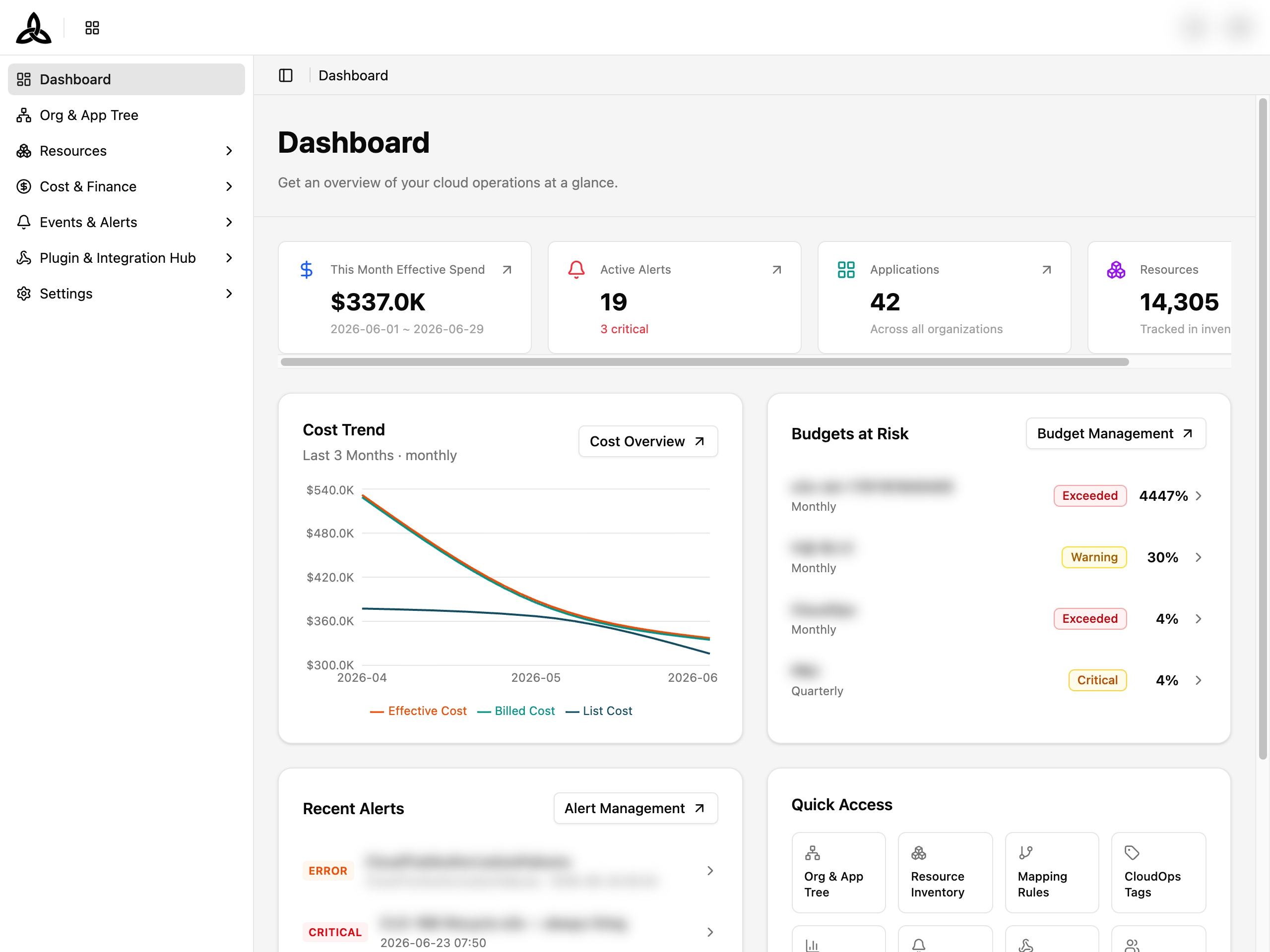
On the [Dashboard] page, you get an overview of your cloud operations at a glance. Every dashboard is built from widgets and grouped into a library — a named board you switch between. Ready-made boards cover the common questions, and you can build your own.
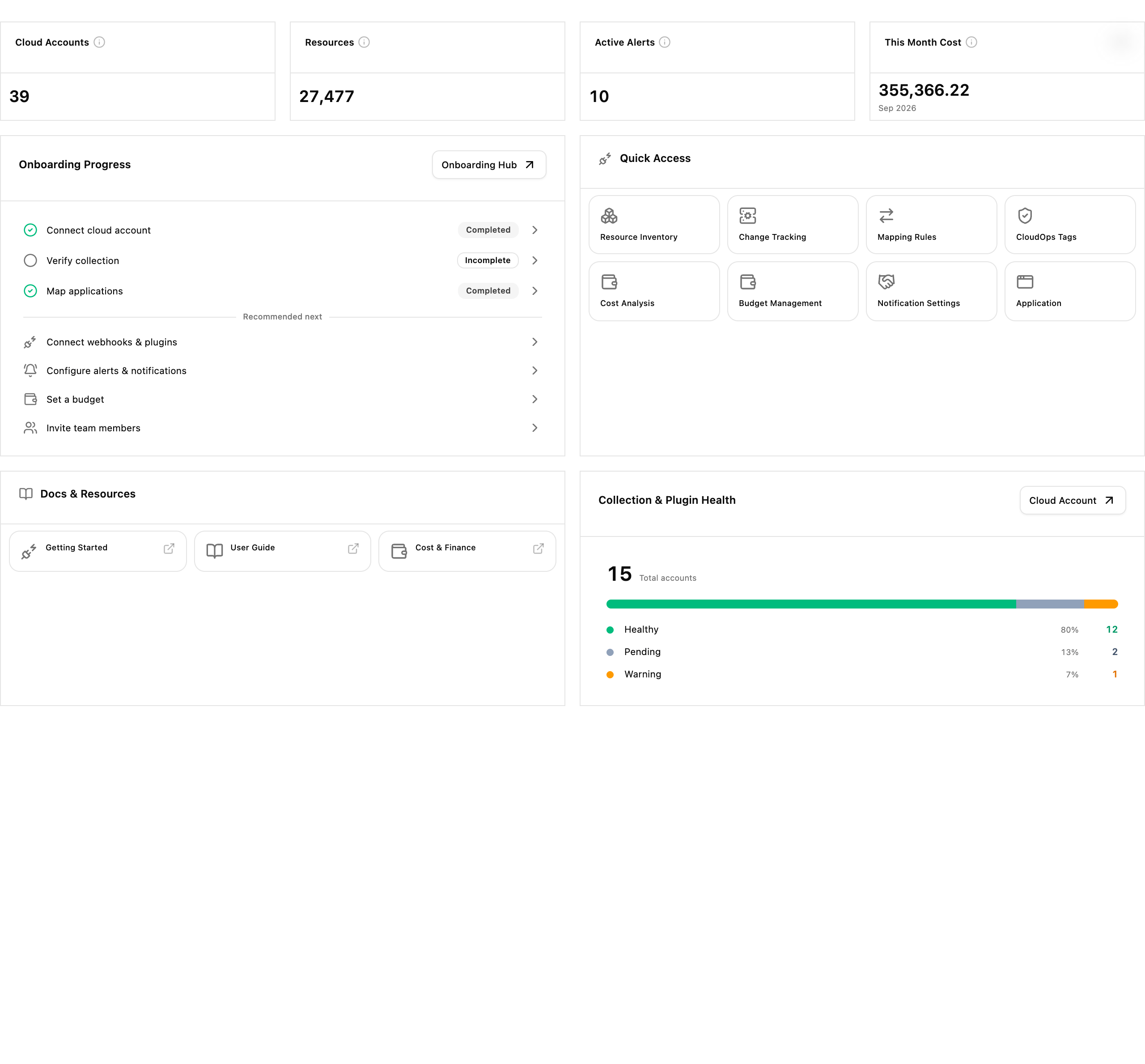
The page opens on Getting Started. Beside the headline counts it tracks how far setup has come — each step marked Completed or Incomplete, with Recommended next listing what to do after — and Quick Access links straight into the menus that do the work. Collection & Plugin Health summarises how many of the connected accounts are healthy, pending, or in warning.
Switching Boards
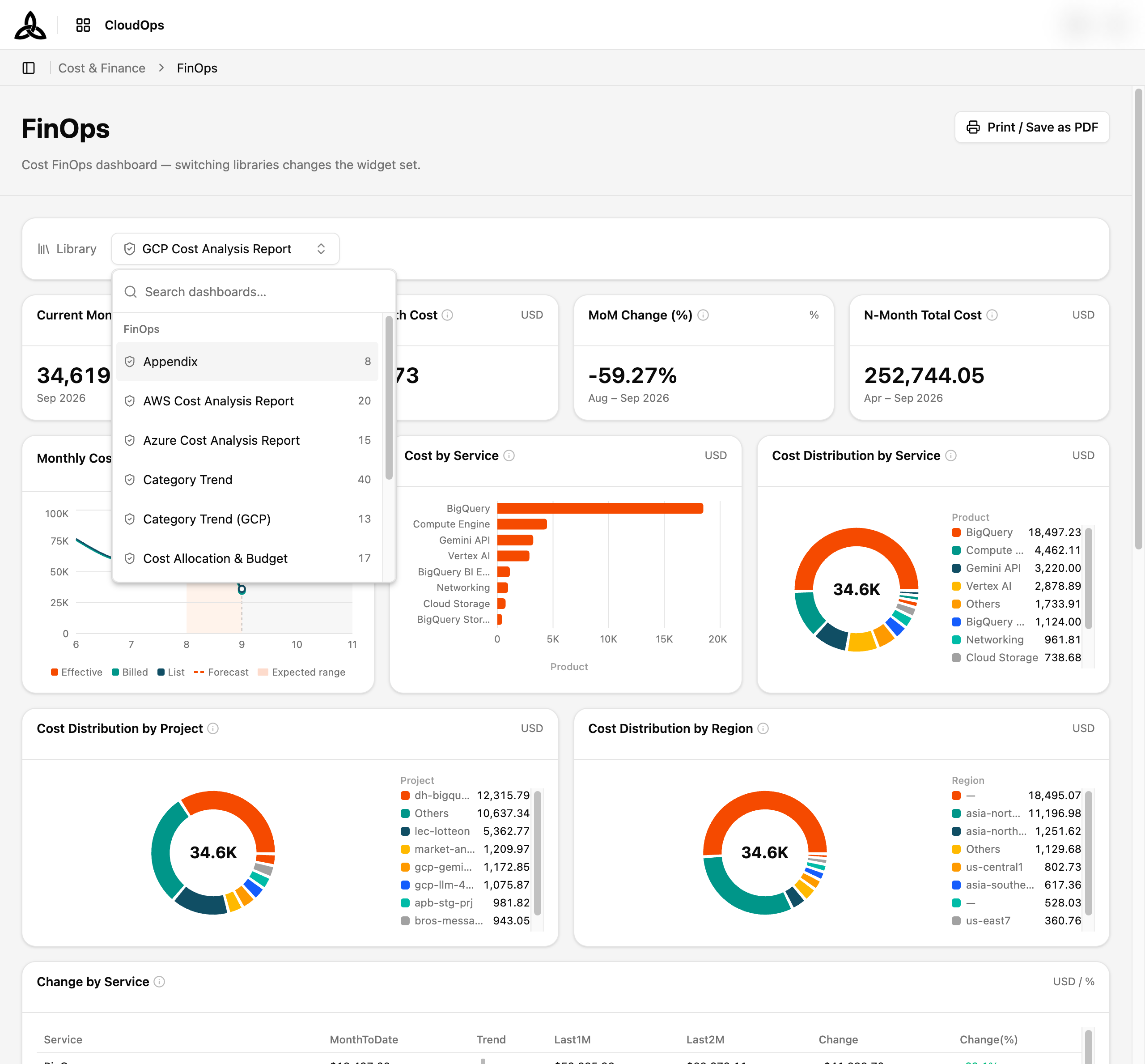
The Library control at the top of the page chooses which board you are looking at. Switching a library swaps the whole widget set.
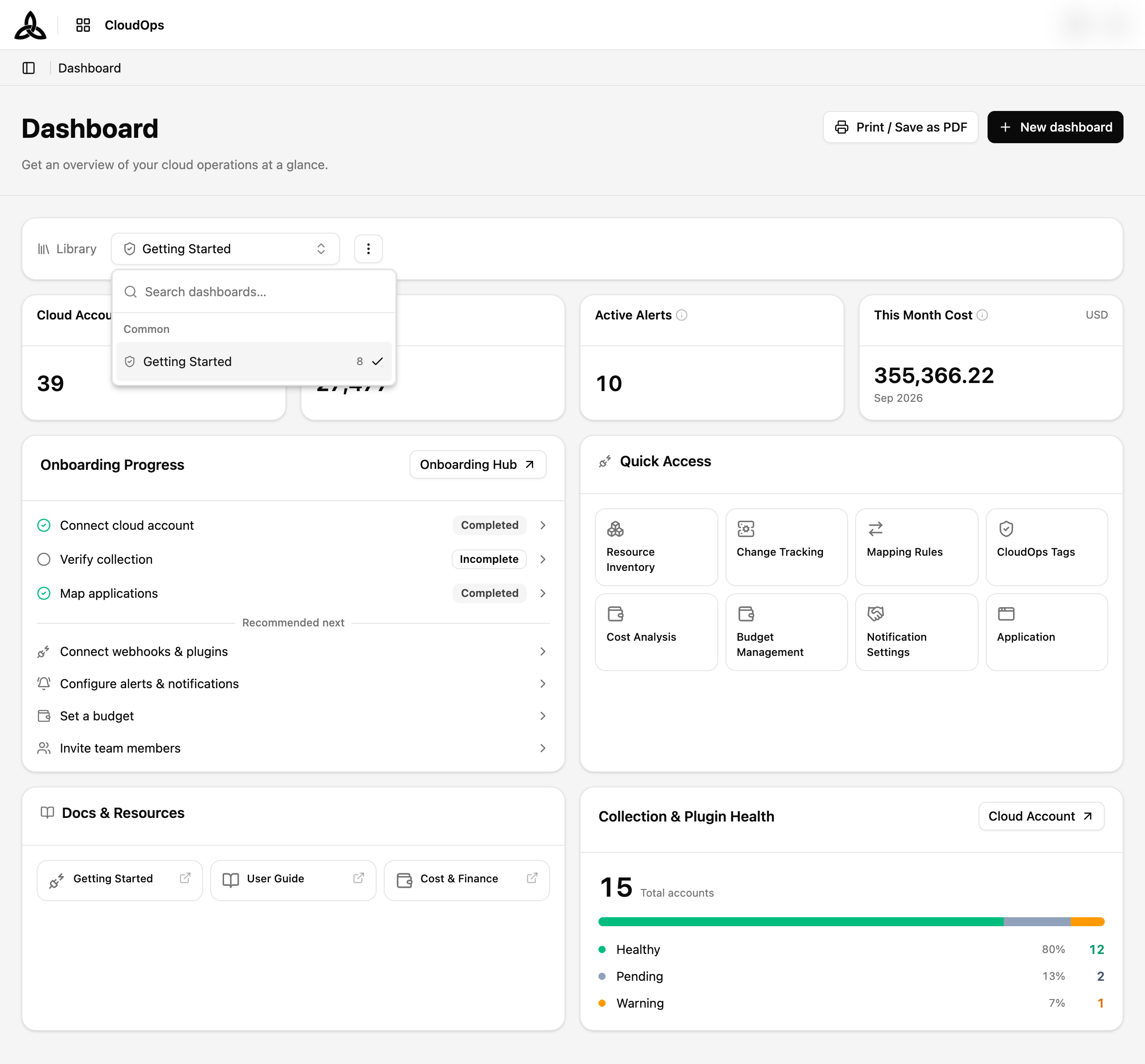
Each entry shows how many widgets the board holds, and the list is searchable. Entries are grouped by where the board came from:
| Group | What is in it |
|---|---|
| Common | Boards that ship with CloudOps. Getting Started — how far along setup is, with links into the menus that finish each step |
| My dashboards | Boards you built yourself. Empty until you create one |
[+ New dashboard] builds your own board — see Building Your Own Board.
Reading Widgets
Widgets come in a few shapes. A KPI card states one number with the period it covers; a chart plots a series over time; a table lists rows; a breakdown groups a total by a dimension you pick from tabs.
The ⓘ beside a widget title explains what that widget measures.
Cost trend with forecast
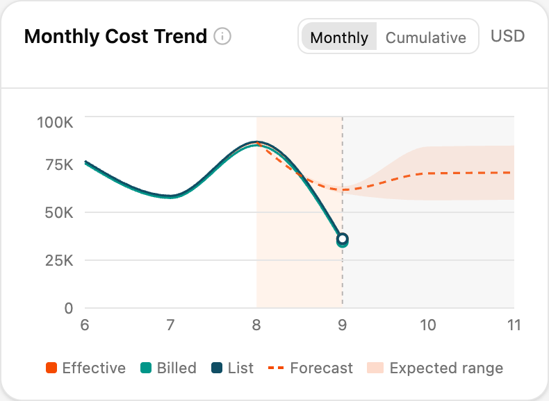
Cost trend widgets do not stop at today. They draw settled cost as a solid line and continue it as a dashed forecast into the months ahead, with a shaded Expected range around the projection.
| Series | Meaning |
|---|---|
| Effective | Cost after discounts and commitments are applied |
| Billed | What was actually invoiced |
| List | Cost at list price, before any discount |
| Forecast | The projection beyond the last settled month, drawn dashed |
| Expected range | How far the projection could reasonably move |
Monthly shows each month on its own; Cumulative adds them up across the period.
Insight widgets
Some widgets do not plot anything — they state a finding in words, as a callout, with the number that backs it.
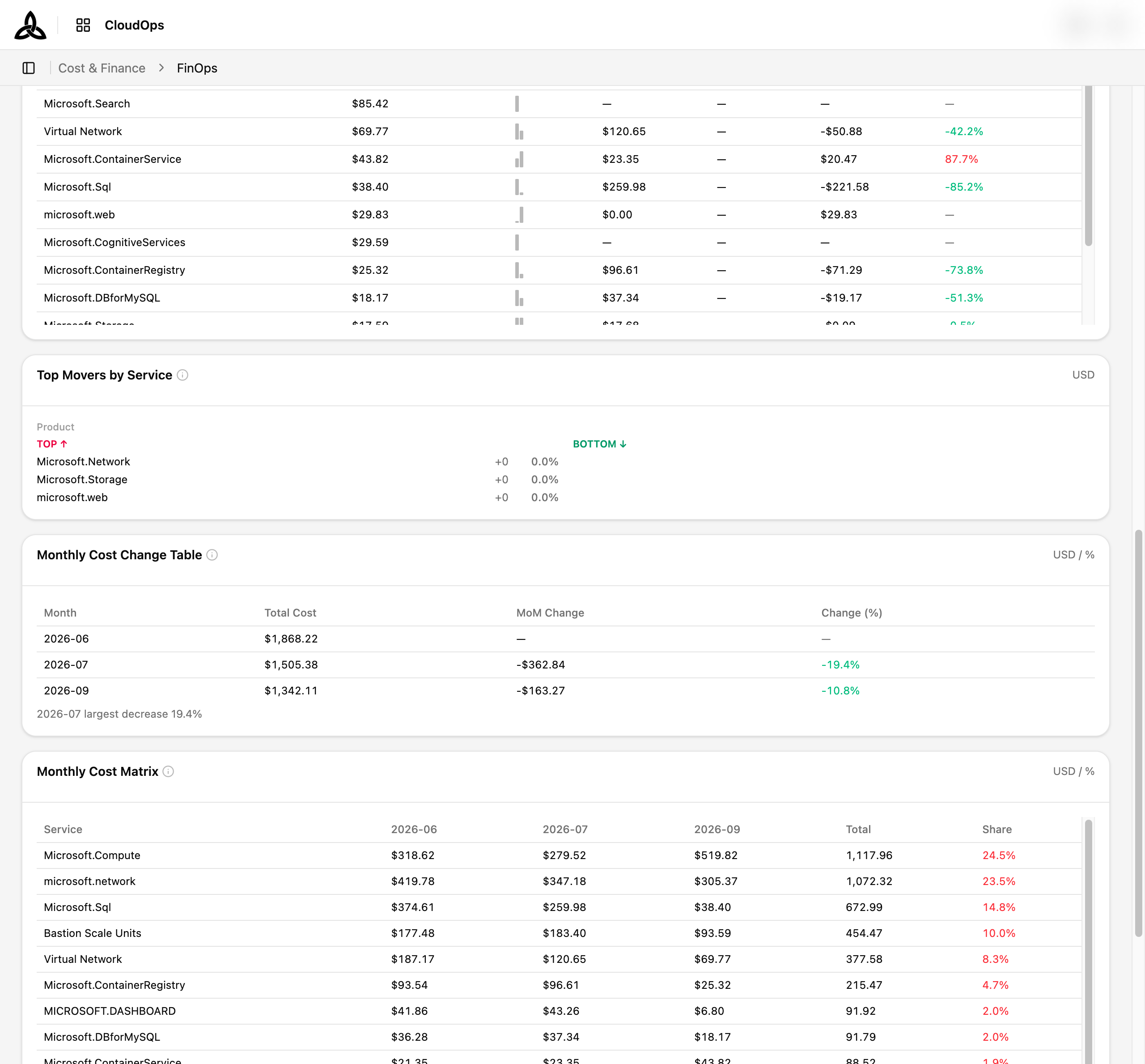
Insights · Cost Trend reports how the total moved against the previous month and what that movement is worth. Insights · Service Mix reports how concentrated the spend is — which services carry most of the cost, and therefore where optimising pays off most.
When a filter does not reach a widget
When a board has filters applied, not every widget can honour all of them. Rather than quietly returning unfiltered numbers, the widget says so on its own card.
| Badge | Meaning |
|---|---|
| Filters partially applied | The widget applied some of the filters; the rest were dropped for this widget |
| Filters not supported | The widget cannot take the current filters at all, so none were applied |
Hovering a badge names exactly which filters were dropped. A widget that applied everything shows no badge — the absence of a badge is the normal case.
Printing a Board
[Print / Save as PDF] in the page header prints the board you are looking at. Your browser’s print dialog does the saving, so “Save as PDF” is whichever PDF destination that dialog offers.
The same button appears on the three screens built from boards — Dashboard, [Cost & Finance > FinOps], and the analysis tab of [Cost & Finance > RI/SP]. It sits in the page header rather than the toolbar menu, because the RI/SP tab has no toolbar to put it in.
Prepare
Selecting the button first loads every widget on the board, including ones you never scrolled to. A progress dialog reports {settled} of {total} widgets ready while it works, and you can cancel from there.
This step exists because a widget that was never on screen has no data to print. Without it those areas come out blank.
Once every widget has settled, the browser’s print dialog opens on its own. If some widgets failed to load, the dialog says how many — those areas are left blank rather than holding up the printout.
The printed page is not a screenshot of the screen. It carries its own header — the board name, As of the moment you printed, and Adjusted filters naming any axis you had changed — and it drops the controls you cannot use on paper, such as the Library bar. Charts print as vectors, so text in them stays sharp at any zoom.
The PDF’s file name
The print dialog proposes a name built from the board, its library name, and the date:
cloudops-<board>-<library-name>-<YYYYMMDD><board> is dashboard, finops, or risp. The extension is added by the browser when it saves.
cloudops-dashboard-20260921. Rename the board in English if you want it named in the file.Building Your Own Board
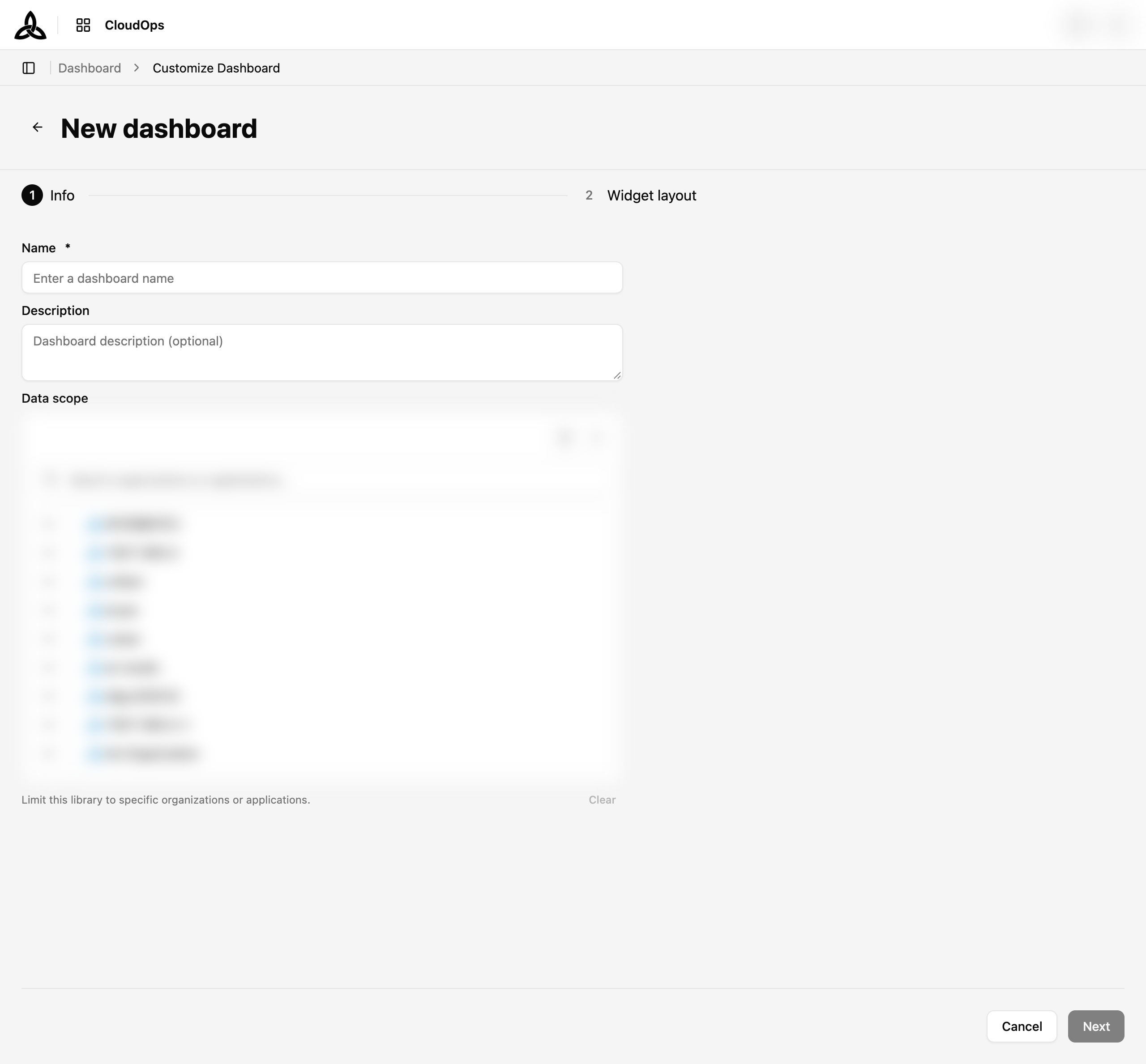
[+ New dashboard] opens a two-step form.
Info
Name the board and choose its data scope — the organizations and applications whose data it should cover.
Widget layout
Pick a starting template on the left, adjust the preview in the middle, and add or remove widgets from the catalog on the right.
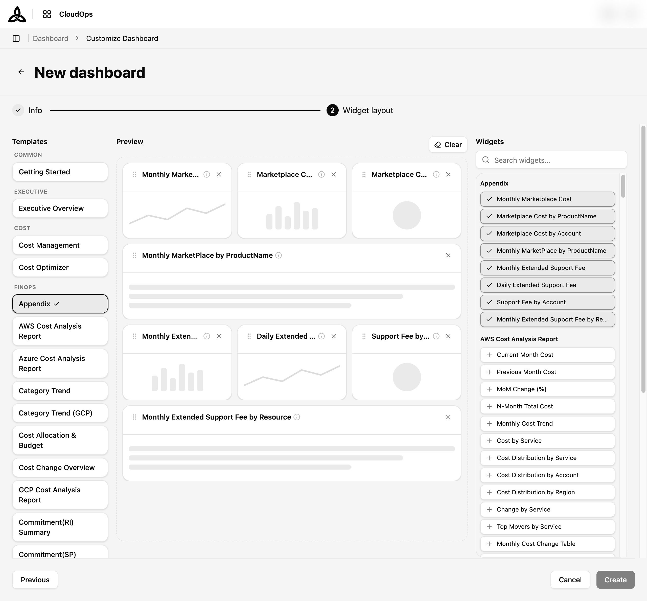
Templates are grouped by purpose:
| Group | Templates |
|---|---|
| Common | Getting Started |
| Executive | Executive Overview |
| Cost | Cost Management, Cost Optimizer |
| FinOps | Appendix, AWS / Azure / GCP Cost Analysis Report, Category Trend, Category Trend (GCP), Cost Allocation & Budget, Cost Change Overview, Commitment(RI) Summary, Commitment(SP) Summary |
| RI/SP | RI/SP Analyzer, CSP/ESP Summary, DBSP Summary, MLSP Summary, RI Summary |
| Operations | Operations Monitoring |
| Security | Security & Compliance |
| — | Blank dashboard |
The catalog lists widgets grouped by the template they belong to, each with a one-line description of what it measures. Widgets already on the board are ticked; + adds one, and [Clear] empties the preview. Search narrows the catalog by widget name.
Create
Select [Create] to save the board. It then appears in the Library list alongside the ready-made ones.
Cost Analysis Reports
Cost analysis reports are boards in the same library system, opened from [Cost & Finance > FinOps]. They are not AWS-only — there is one report per provider.
| Report | Covers |
|---|---|
| AWS Cost Analysis Report | AWS spend |
| Azure Cost Analysis Report | Azure spend |
| GCP Cost Analysis Report | GCP spend |
Each report opens with KPI cards — Current Month Cost, Previous Month Cost, MoM Change (%), N-Month Total Cost — then the forecast-bearing Monthly Cost Trend, distribution charts, change tables, and the insight callouts at the end.
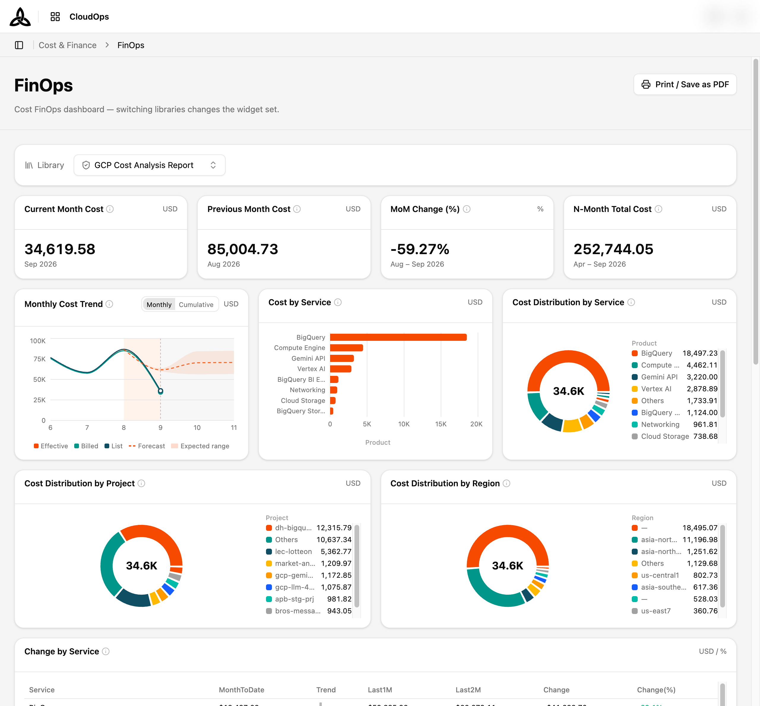
The GCP report breaks spend down along four axes the other reports do not have:
| Widget | Reads |
|---|---|
| Monthly Trend by FinOps Category | Instance · Storage · Data Transfer · Others over six months |
| FinOps Category Share | Category share this month |
| Instance Family Share | Top 8 machine families this month, plus Others |
| Cost by Instance Generation | Cost by machine generation this month |
The category trend sits after Monthly Cost Trend; the three breakdowns follow Cost Distribution by Region. There is no processor-type breakdown — GCP reports that field as Unknown on almost every row, so a chart of it would say nothing.
The dimensions differ by provider, because the providers differ. Each report breaks cost down by that provider’s own unit of ownership — Account on AWS, Project on GCP, Subscription on Azure — so a report always names things the way its provider’s console does. A widget belongs to exactly one provider’s report; the reports never mix providers into one number.
The reports are not mirrors of one another, and they are not meant to be. Each carries the breakdowns its provider’s billing data can actually support — which is why the GCP report has a FinOps category breakdown the AWS one lacks, and the AWS report has usage-type and operation breakdowns GCP’s source does not carry.
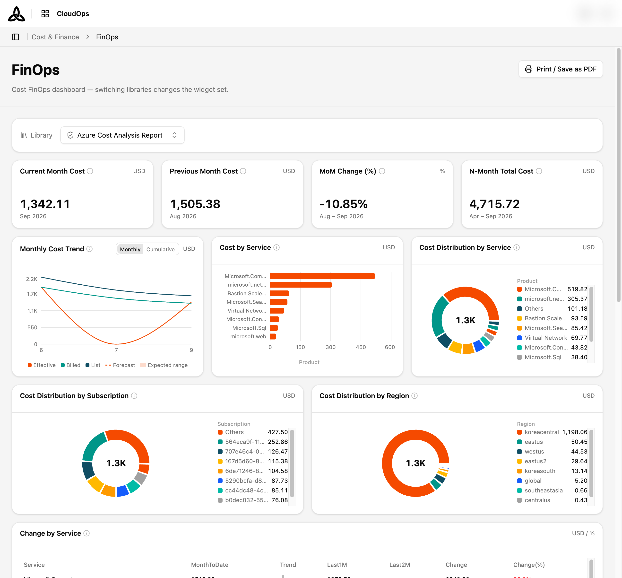
Commitment coverage has its own boards — Commitment(RI) Summary and Commitment(SP) Summary — and the RI/SP template group holds the analyzer and per-plan summaries.
Related
For building a breakdown yourself rather than reading a prepared board, use Cost Analysis. The FinOps screen these reports open on is covered in FinOps.