RI/SP
On the [Cost & Finance > RI/SP] page you can see at a glance how well your AWS usage is covered by RI and Savings Plans commitments, find where buying more would save the most, simulate a purchase, and review the detailed recommendation and coverage reports.
Tabs
The page opens on Dashboard and is split into four tabs, each answering a different question:
| Tab | What it answers |
|---|---|
| Dashboard | “Where do I stand, and what should I do first?” — coverage, savings potential, expiring commitments, and the single best next purchase |
| Simulation | “What would it cost if I committed?” — model a purchase against your own recent usage |
| Recommend | “What should I buy?” — prepared reports per commitment family |
| Analyzer | “How well am I covered already?” — current coverage and utilisation in full |
Dashboard
The Dashboard condenses the other three tabs into one screen: the numbers that matter most, then the widgets that explain them. Everything on it is based on the most recent daily cost load, and every card that has more detail elsewhere links to the tab that holds it (Recommend →, Analyzer →).
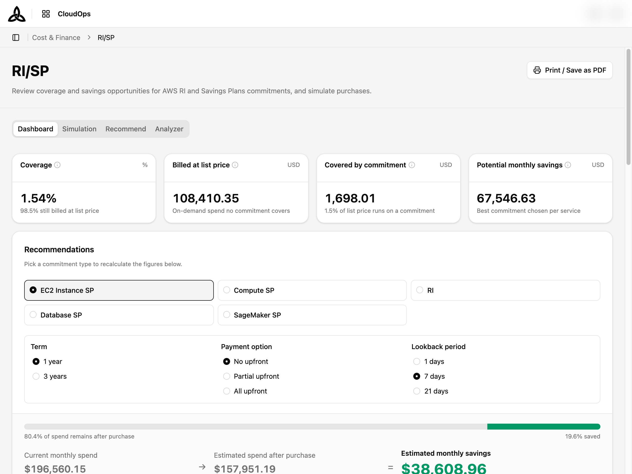
Summary cards
| Card | Meaning |
|---|---|
| Coverage | Share of your commitment-eligible usage that a commitment actually covered. The caption gives the remainder — how much is still billed at list price |
| Billed at list price | On-demand spend that no commitment applied to. This is your savings opportunity |
| Covered by commitment | Spend that a commitment applied to, at its list-price equivalent — the amount actually billed is lower |
| Potential monthly savings | The single best commitment for each service, summed. Where two commitments exclude each other (EC2 Compute SP versus EC2 Instance SP) only the larger counts. Based on 1-day average usage |
Recommendations
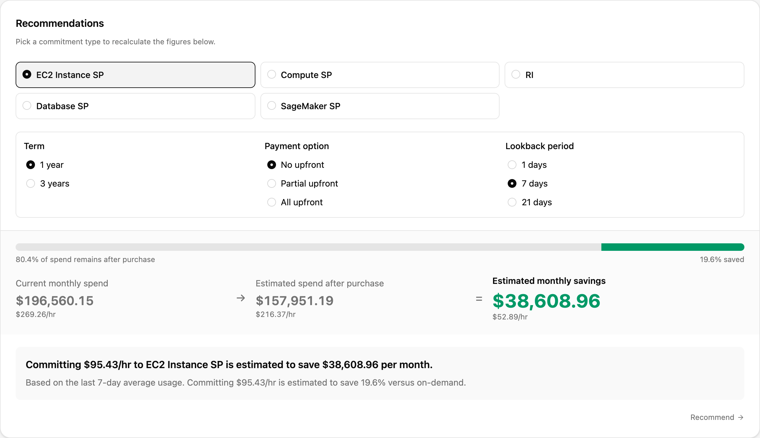
Pick a commitment type — EC2 Instance SP, Compute SP, RI, Database SP, or SageMaker SP — and the card recalculates on the spot. Term (1 year / 3 years), Payment option (No upfront / Partial upfront / All upfront), and Lookback period (1 / 7 / 21 days) change the assumption the estimate is built on.
The gauge shows how much of today’s spend would remain after the purchase and how much is saved, followed by Current monthly spend → Estimated spend after purchase = Estimated monthly savings, each with its hourly rate. The sentence underneath states the recommended hourly commitment in plain words. Recommend → opens the full report for that commitment family.
Insights · RI/SP Commitments

Findings generated by rules over coverage, expiry, and the recommendations — for example eligible spend billed at list price against the coverage target, services with no commitment at all, or list-price spend concentrated in one service. Each finding carries its Impact in money. When the evidence for a rule is below its threshold, nothing is shown for it, so an empty card is a good sign.
Coverage trend and expiring commitments
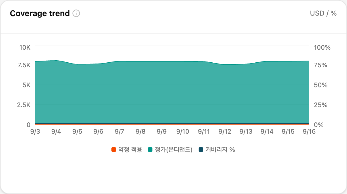
Coverage trend plots commitment-covered spend against on-demand spend day by day, with the coverage rate on the right axis, so a step change — a commitment expiring, a purchase landing — is visible as it happens.
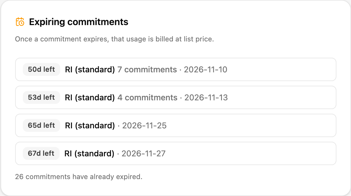
Expiring commitments lists upcoming expiries with the days left, the commitment type, how many commitments end that day, and the date. Once a commitment expires, that usage is billed at list price, so this is the list to act on before the date. Commitments that have already expired are left out of the list and counted in the line beneath it.
Savings recommendations
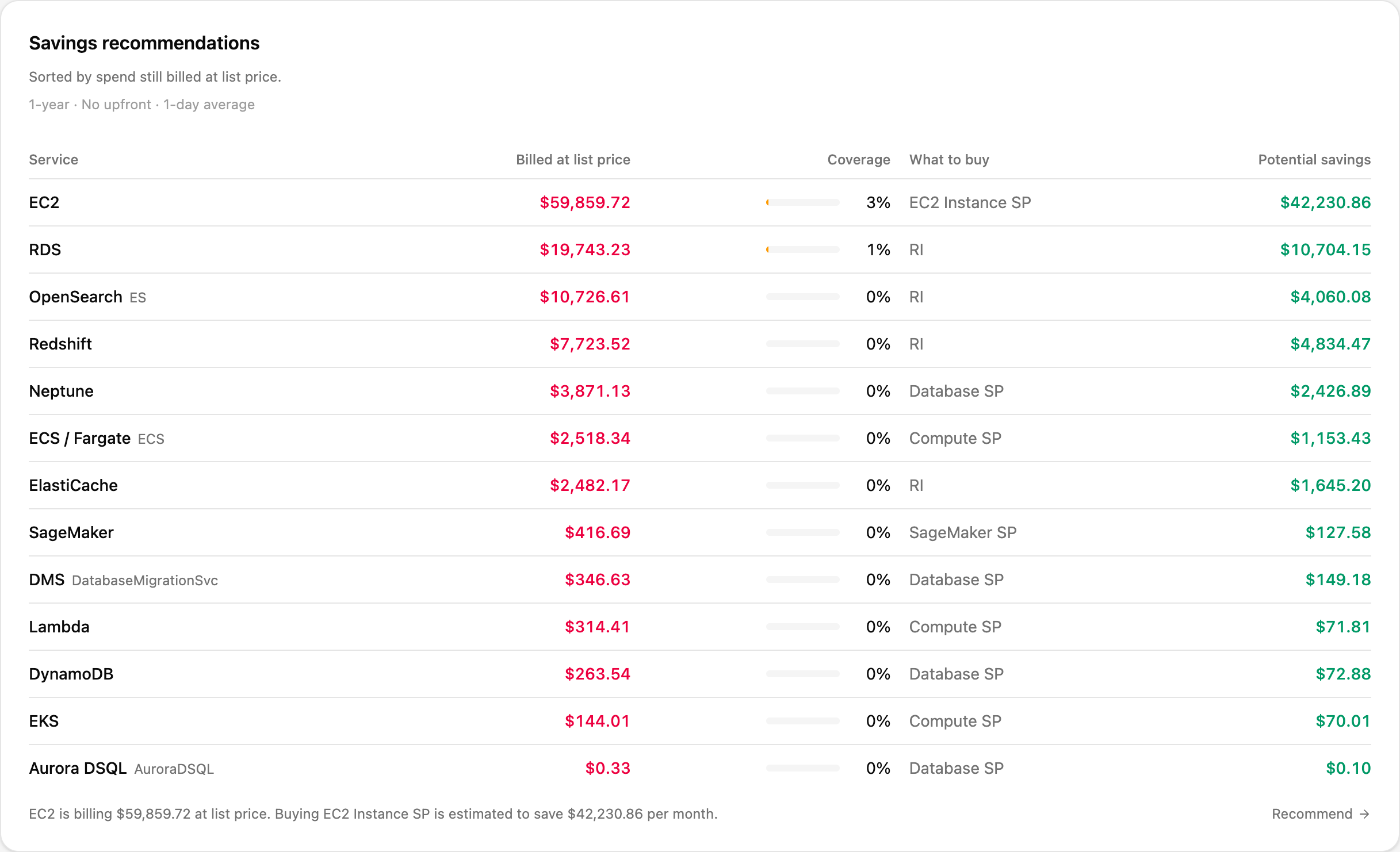
One row per service, sorted by the spend still billed at list price.
| Column | Description |
|---|---|
| Service | The AWS service |
| Billed at list price | On-demand spend in that service that no commitment covers |
| Coverage | How much of the service’s eligible usage is already covered |
| What to buy | The commitment type that saves the most for this service, or No recommendation |
| Potential savings | Estimated monthly saving from that purchase |
The basis is fixed — 1-year · No upfront · 1-day average — and the footnote spells out the top row as a sentence. A service with zero coverage and a large list-price bill is the one to review first.
Coverage by account
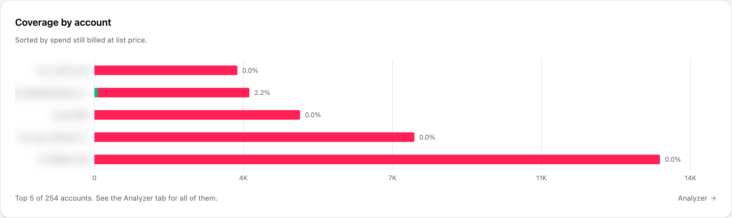
The five accounts with the most list-price spend, each bar split into the part covered by a commitment and the part still billed at list price, with the coverage rate beside it. The footnote tells you how many accounts there are in total; Analyzer → shows all of them.
Hourly coverage by service sits below and shows how coverage moves through the day for each service — useful for spotting usage that only runs part-time and is therefore a poor fit for a commitment. It stays empty until hourly coverage data is available for the tenant.
Simulation
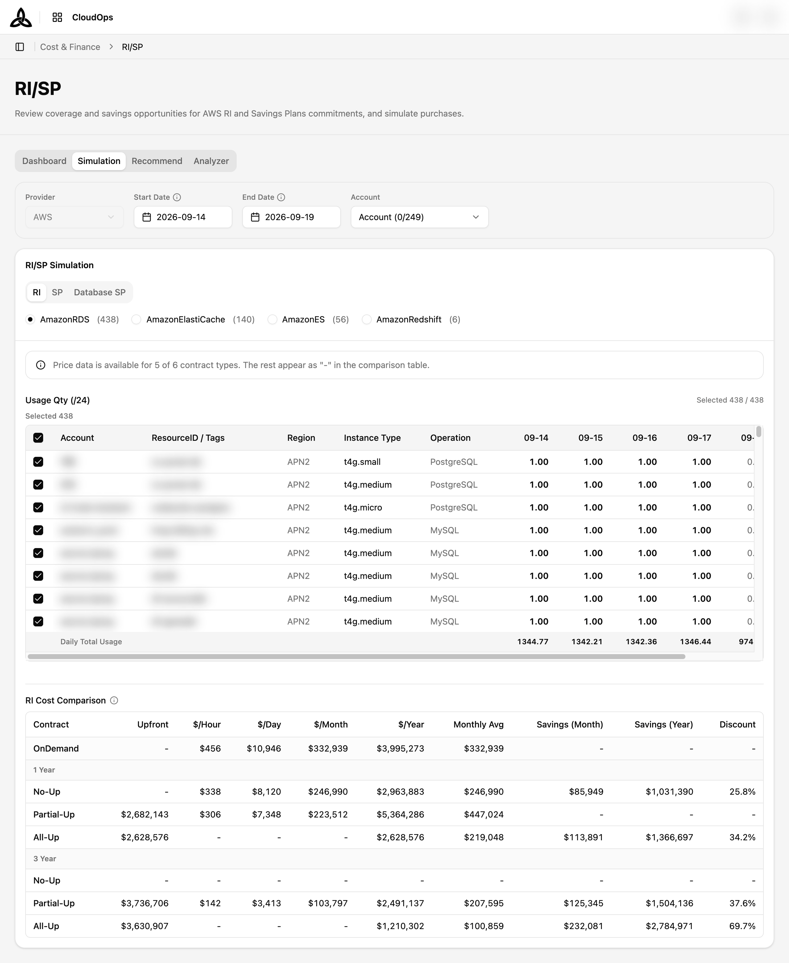
Estimate what a Reserved Instance, Savings Plans, or Database Savings Plans commitment would cost — based on your own recent usage — before you actually buy one.
Page Layout
| Section | Purpose |
|---|---|
| Filter Bar | Provider, the usage period, and the account scope for the simulation |
| Commitment tabs | RI / SP / Database SP — each tab simulates a different commitment type |
| Product selector | Which service the simulation targets, with the number of eligible resources next to each entry |
| Usage Qty (/24) | The resources found in the period. Tick the ones you want to include |
| Cost Comparison | On-demand versus each contract option for the resources you ticked |
Filter Bar

| Control | Description |
|---|---|
| Provider | Fixed to AWS — commitment simulation is available for AWS only |
| Start Date / End Date | The usage window the simulation is based on |
| Account | Multi-select over the accounts in scope. All selects every account; the button shows Account (selected/total) |
Choosing a commitment type
The three tabs are independent simulations. Switching tabs reloads the eligible resources, so your resource selection is cleared — pick the tab first, then tick resources.
| Tab | What it simulates |
|---|---|
| RI | Reserved Instances for a single service. The product selector is single-choice |
| SP | Savings Plans — Compute Savings Plans and EC2 Instance Savings Plans |
| Database SP | Database Savings Plans, split into Instance and Serverless categories |
Selecting target resources
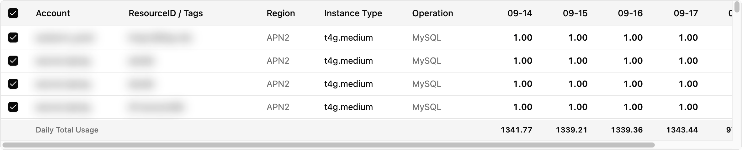
Usage Qty (/24) lists every resource found in the period. The counter at the right reads Selected 408 / 408 — picked against found — and rows are split into a Selected section and an Unselected section so your picks stay together at the top.
| Column | Description |
|---|---|
| Account | The account that owns the resource |
| ResourceID / Tags | Resource identifier and its tags |
| Region | Region code |
| Instance Type | Instance type as billed |
| Operation | Billing operation (for example the OS for EC2) |
| Date columns | Daily usage quantity — usage hours divided by 24, so 1.00 means the resource ran all day |
| Daily Total Usage | Footer row totalling the selected resources per day |
Until you tick at least one resource, the comparison area simply asks you to select target resources.
RI Cost Comparison
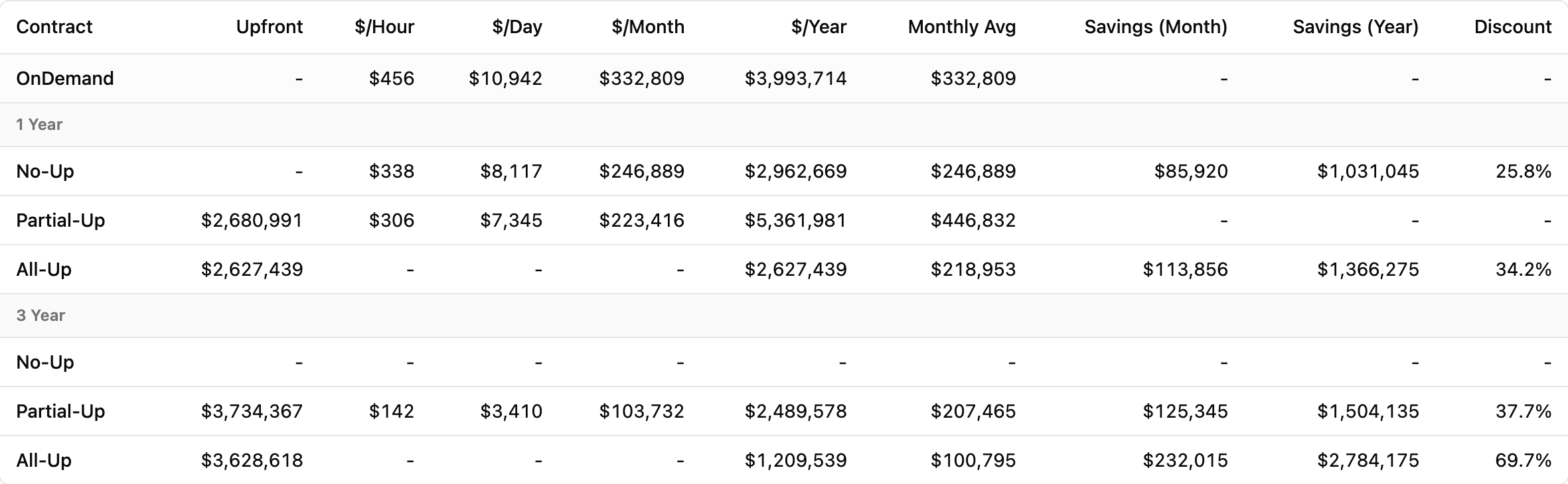
The table compares on-demand cost with each Reserved Instance contract, grouped into 1 Year and 3 Year terms.
| Column | Description |
|---|---|
| Contract | OnDemand (baseline), then No-Up (no upfront), Partial-Up (partial upfront), All-Up (all upfront) |
| Upfront | The lump sum paid at purchase |
| $/Hour, $/Day, $/Month, $/Year | Recurring cost at each granularity |
| Monthly Avg | Yearly cost spread evenly across 12 months, so upfront-heavy contracts stay comparable |
| Savings (Month) / Savings (Year) | Reduction against the on-demand baseline |
| Discount | Savings as a percentage of the on-demand cost |
-, and the banner above the table reports how many of the contract types could be priced.SP Cost Comparison
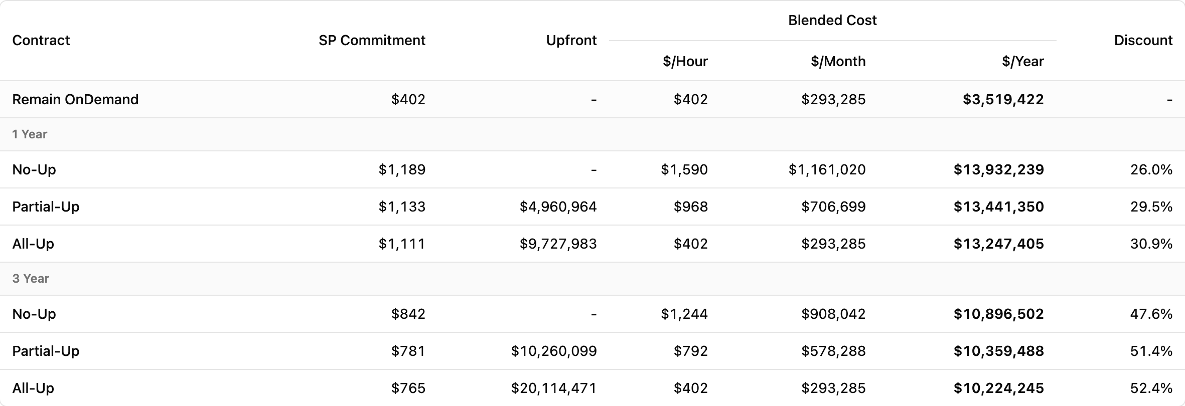
Savings Plans are simulated as a commitment rate per hour rather than a per-instance reservation, so the table is shaped differently.
| Column | Description |
|---|---|
| Contract | Remain OnDemand (the portion not covered by the plan), then No-Up / Partial-Up / All-Up per term |
| SP Commitment | The hourly commitment amount the plan would be bought at |
| Upfront | The lump sum paid at purchase |
| Blended Cost | Total cost combining the commitment and the remaining on-demand usage, shown as $/Hour, $/Month, and $/Year |
| Discount | Savings as a percentage of the on-demand cost |
The section separates Compute Savings Plans from EC2 Instance Savings Plans, and reports the plan’s Coverage, the SP Target OnDemand amount it applies to, and the Remain OnDemand left uncovered.
Database SP Cost Comparison

Database Savings Plans are compared per category — Instance and Serverless — with the resource count shown next to each category name. The columns match the SP table.
Recommend
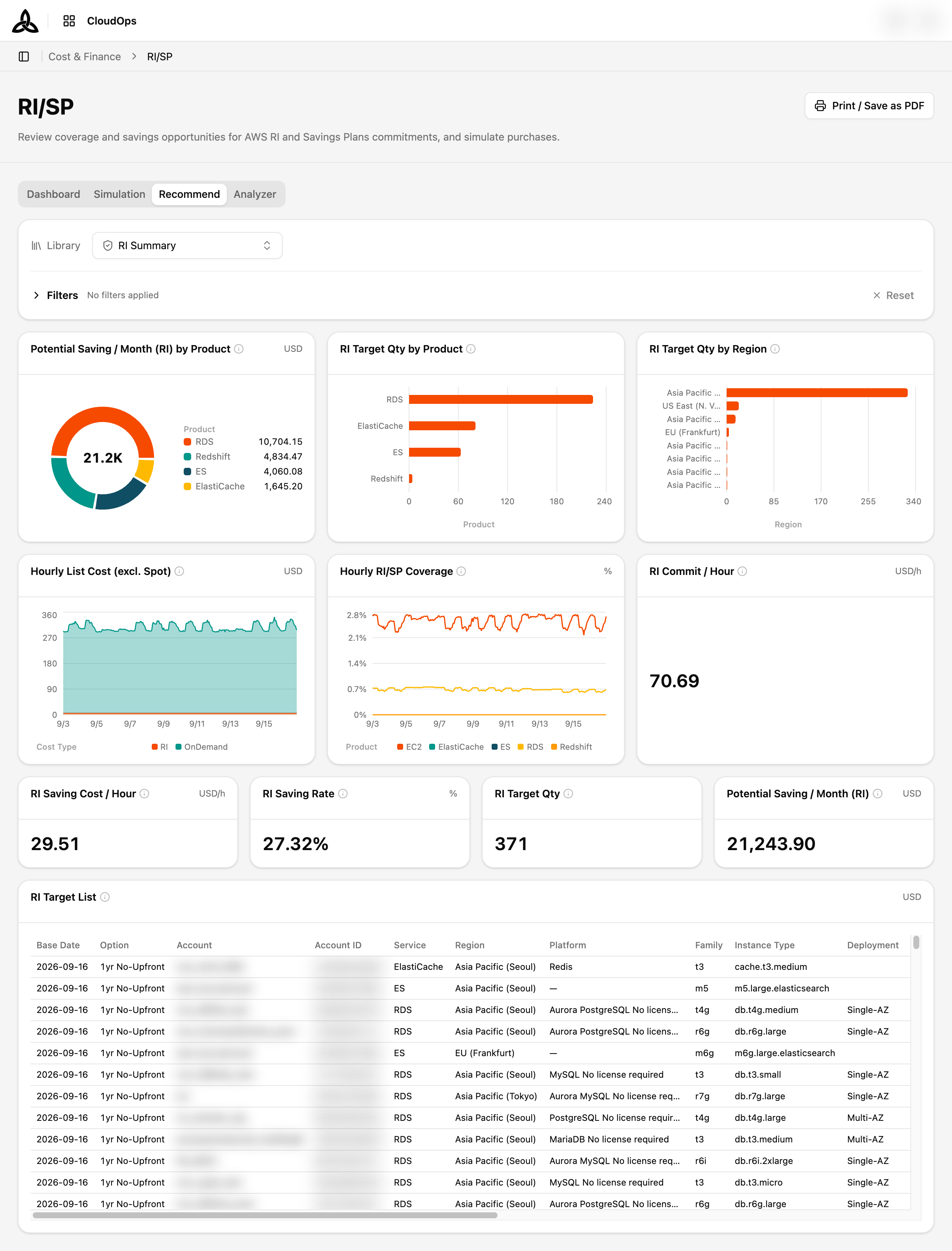
Where Simulation models a purchase you describe, Recommend starts from your usage and proposes what is worth committing to. The Library selector at the top switches between four prepared reports, ordered the way the decision is usually made:
| Report | Covers |
|---|---|
| RI Summary | Reserved Instances |
| CSP/ESP Summary | Compute and EC2 Savings Plans |
| MLSP Summary | SageMaker Savings Plans |
| DBSP Summary | Database Savings Plans |
Each report combines the same kinds of panel — potential monthly saving broken down by product, target quantity by product and by region, hourly list cost against coverage, and a headline KPI row (saving per hour, saving rate, target quantity, potential monthly saving). Beneath them, a Target List table itemises every candidate resource with its option, service, region, platform, family, instance type, and deployment.
Filters above the panels narrows every widget on the report at once; [Reset] clears them.
Analyzer
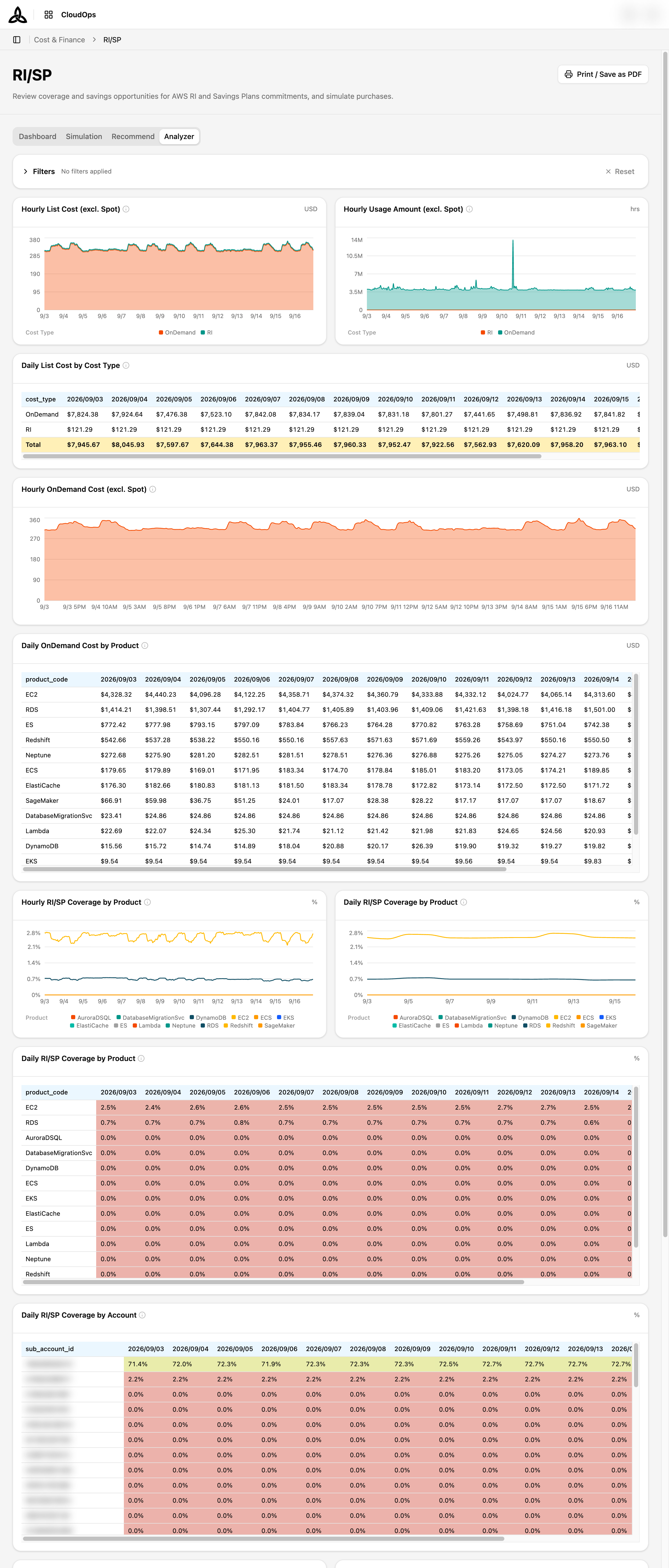
Recommend answers what to buy; Analyzer answers how much of what you already bought is doing its job. It is a single report, so there is no library selector — the panels load directly.
Use it to check coverage and utilisation before adding another commitment: buying more while existing commitments are under-used moves the problem rather than solving it.