Cost Overview
On the [Cost & Finance > Cost Overview] page, you can monitor cloud cost trends and manage unmapped costs and data collection status at a glance.
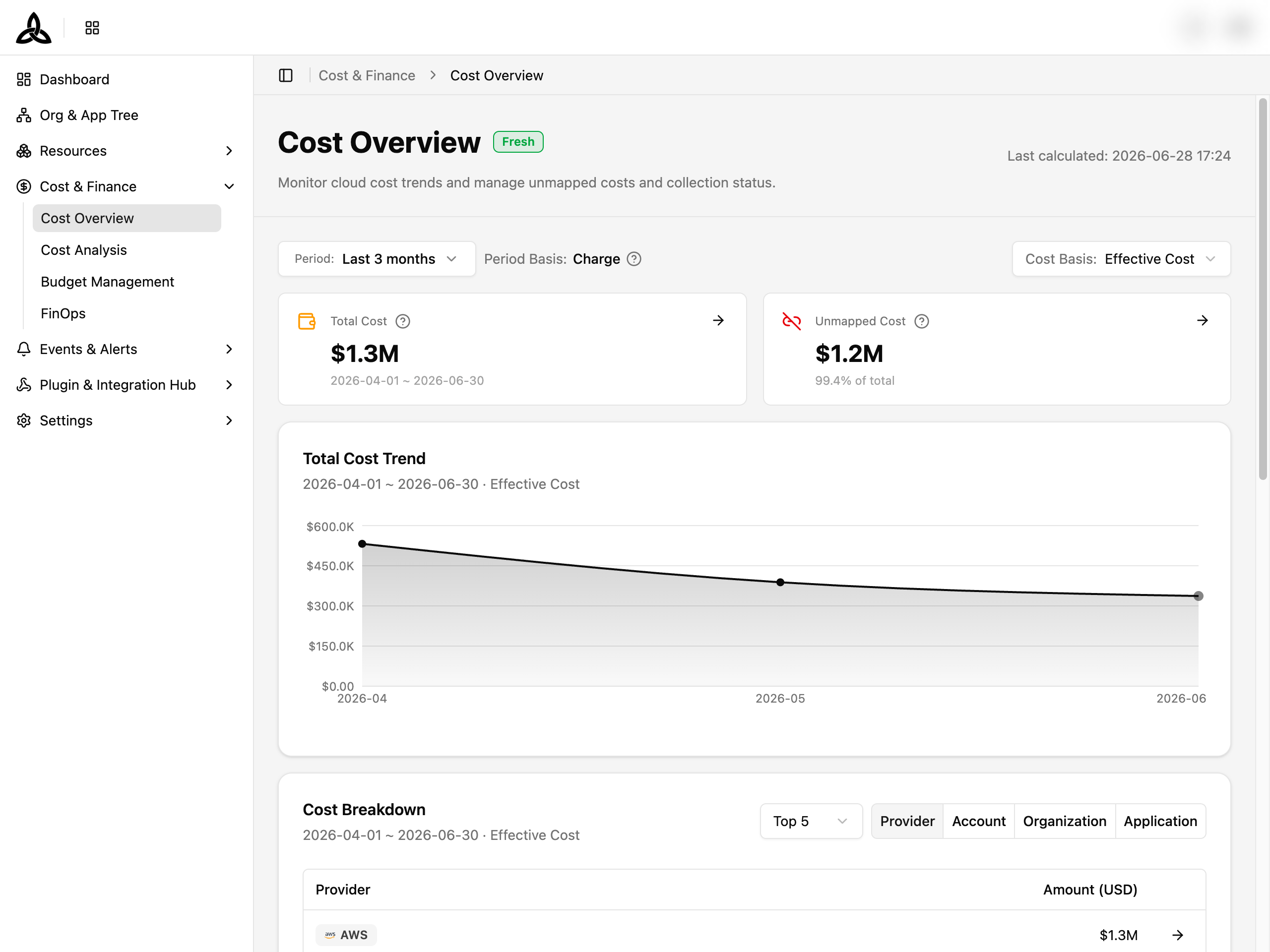
Page Layout
The page is composed of seven stacked sections, each backed by an independent query so partial failures don’t block the rest of the view:
| Section | Purpose |
|---|---|
| Header | Page title, Data Freshness badge, and the last-calculated timestamp |
| Data Status Banner | Banner that appears when data collection is delayed, partial, stale, failed, or unknown |
| Filter Bar | Period, Period Basis, and Cost Basis controls |
| Summary Cards | Total Cost and Unmapped Cost metric cards |
| Total Cost Trend | Line chart with selectable period preset |
| Cost Breakdown | Multi-tab table (Provider / Account / Organization / Application) with Top 5 / Top 20 |
| Cost Attribution | Treemap-style view with Organization / Application / Account tabs |
| Mapping Health | Donut chart + tree table summarizing Mapped / Unmapped composition |
Data Freshness Status
The Data Freshness badge next to the page title and the optional banner below it summarize how recently cloud cost data was collected.
Badge
| Badge | Meaning |
|---|---|
| Fresh | Most recent collection succeeded — displayed values reflect the latest available data |
| Delayed | Collection is running behind schedule. Latest data is not reflected; values are based on the last successful collection |
| Stale | No new cost has been collected since the last successful run |
| Partial | Some sources are delayed — only successfully collected sources are included |
| Failed | Collection failed — completeness cannot be guaranteed and values may differ from real costs |
| Unknown | Status could not be determined |
| Deleted | Source has been removed |
Banner actions
When the status is anything other than Fresh, a banner is rendered with two actions:
| Action | Description |
|---|---|
| Source Details | Opens a dialog listing each cost source with its individual status and last successful collection time |
| Retry / Recheck | Re-runs the collection status query |
Filtering
The filter bar drives every downstream chart and table. Three controls, left to right:
| Filter | Description |
|---|---|
| Period | Choose a preset (This month (MTD) / Last 3/6/12/24 months) or a custom Month Range. Range is capped at 2 years |
| Period Basis | Read-only indicator (Period Basis: Charge) — costs are aggregated by the time they were actually incurred |
| Cost Basis | Effective Cost (default), Billed Cost, or List Cost |
Cost Basis and Period are persisted to the URL, so reloading the page or sharing the link preserves the same view.Cost Summary

| Card | What it shows |
|---|---|
| Total Cost | Sum of cloud costs for the selected period. Includes a shortcut to Cost Analysis (→ icon) that carries the current filter |
| Unmapped Cost | Sum of resource_unmapped (resources whose CSP account is not connected) and app_unassigned (resources not linked to any application) costs, with the share of total. The → icon scrolls to the Mapping Health card |
Hover the field name for the tooltip describing how each metric is computed.
Total Cost Trend
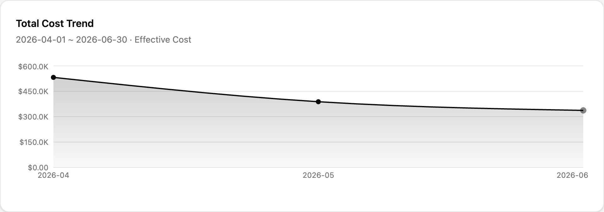
A monthly line chart showing total cost over the selected period.
| Element | Description |
|---|---|
| Period preset | This Month / Last 3 / 6 / 12 Months quick switches |
| Custom range | Start Month / End Month pickers — bounded by 2 years |
| Chart label | Each data point is labelled Cost. An In progress (aggregating) annotation marks months that have not finished aggregation yet |
| Empty state | When the chart has no data, No chart data available. is shown in place of the line |
Cost Breakdown
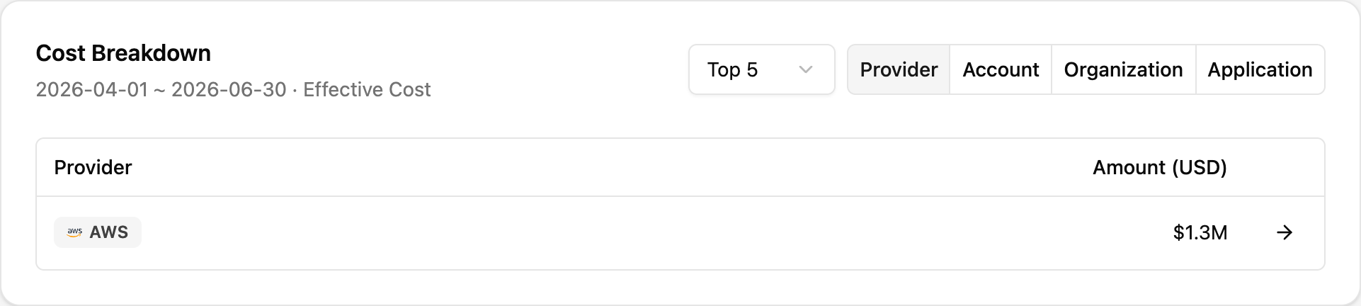
The Cost Breakdown card decomposes the period’s spend along one of four dimensions, ranked by amount.
Tabs
| Tab | Dimension |
|---|---|
| Provider | Cloud provider (AWS / Azure / Google Cloud / …) |
| Account | CSP sub-account |
| Organization | Organization unit (top 2 levels only — see callout) |
| Application | Registered application |
Top N
The Top 5 / Top 20 toggle controls how many rows the table holds. Remaining cost is folded into an Others row so the total matches the Total Cost in the summary above.
Status badges
For the Organization and Application tabs, each row may carry a status badge:
| Badge | Meaning |
|---|---|
| Mapped | The resource cost is linked to a known entity |
| Unmapped | Resources whose CSP account is not connected |
| Unassigned | Resources not linked to any application |
Cost Attribution
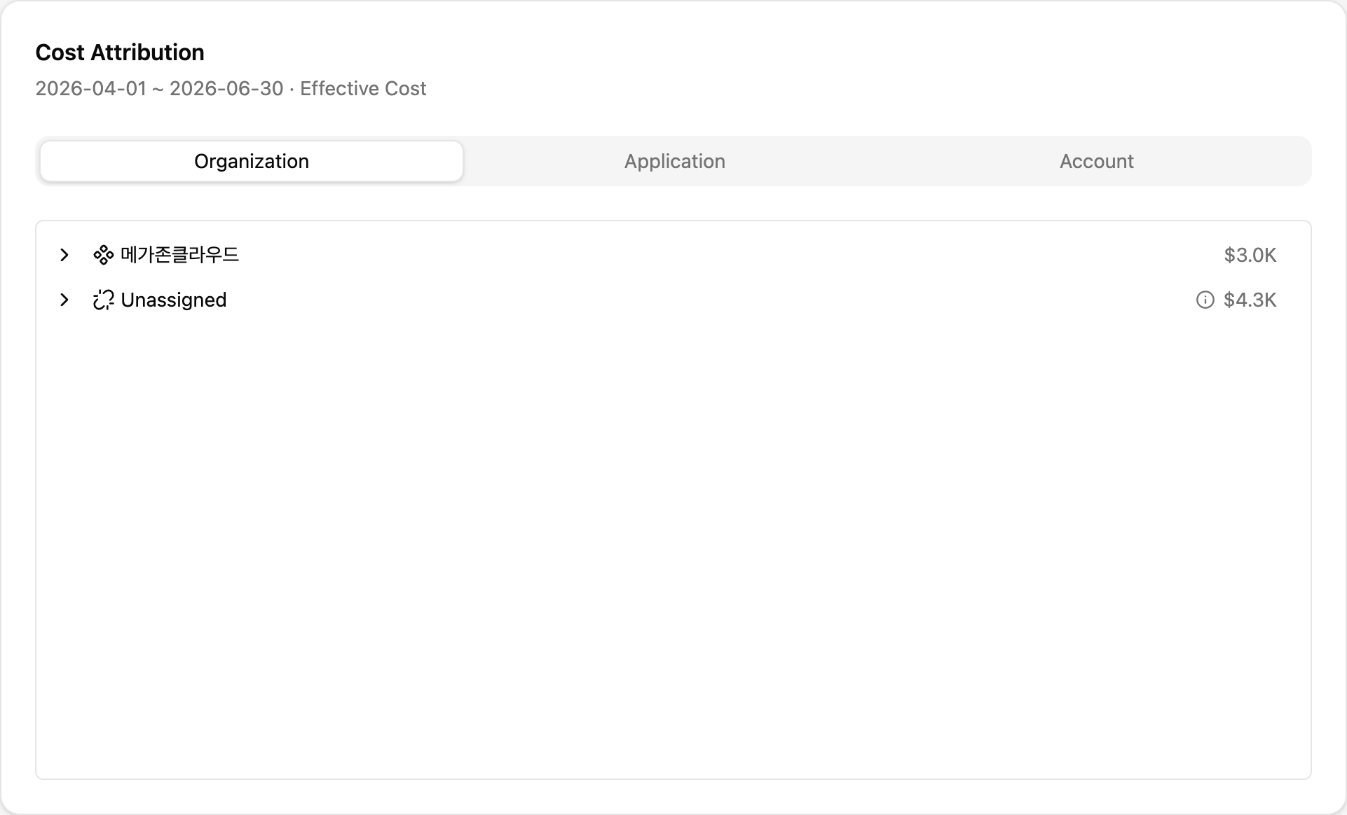
Visualizes cost share across:
| Tab | Description |
|---|---|
| Organization | Cost grouped by organization |
| Application | Cost grouped by application |
| Account | Cost grouped by CSP account |
An Unassigned bucket collects cost from applications that have not been assigned to any organization. Hover any block for the exact amount and ratio.
Mapping Health
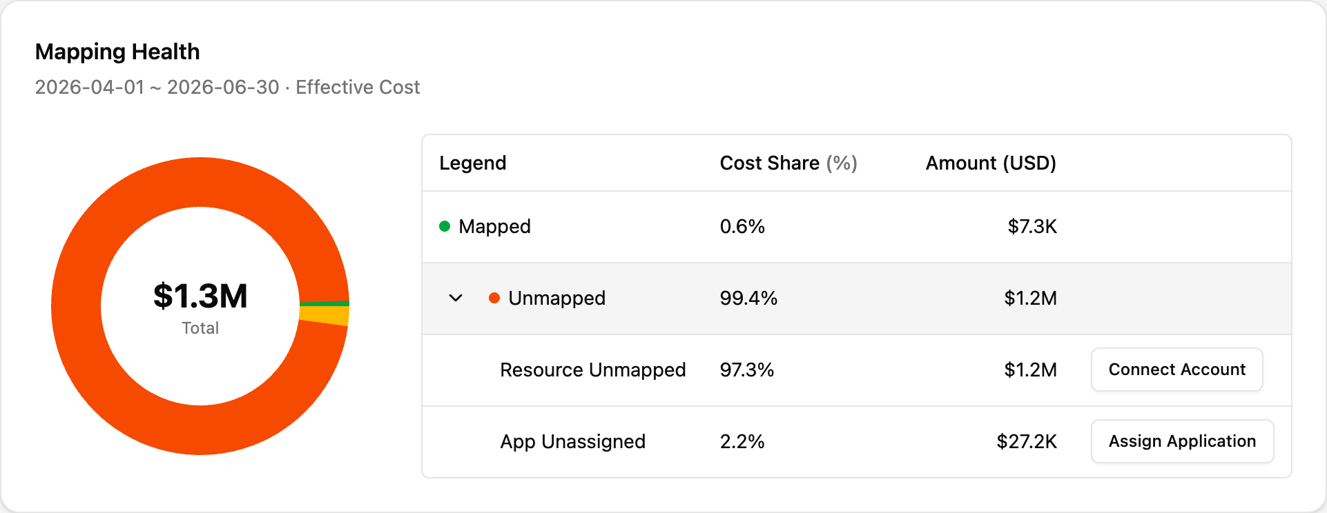
A donut chart paired with a tree table that breaks down cost by mapping state.
Visualization
The donut chart segments are colored by status. The center of the donut shows the Total cost for the selected period.
Tree table
| Row | Description |
|---|---|
| Mapped | Resources with a connected account and an assigned application |
| Unmapped (parent) | Sum of the two child rows below — expandable via the chevron |
| ↳ Resource Unmapped | Resources whose CSP account is not connected. Action: Connect Account — opens a dialog that links to the Cloud Accounts page |
| ↳ App Unassigned | Resources not linked to any application. Action: Assign Application — opens a dialog that links to the Applications page |
Columns: Legend, Cost Share (%), Amount (USD), Action.
Empty State
When no cost data is available for the selected period, the page renders “No cost data available” with the description “There is no data for the selected period”. Adjust the Period filter to a different range to reload data.
Error State
If any of the underlying queries fail, the affected card shows “Failed to load data” with a Retry button. Other cards continue to render independently.