Cost Analysis
On the [Cost & Finance > Cost Analysis] page, you can monitor cost trends for a selected period and analyze detailed expenses from multiple perspectives.
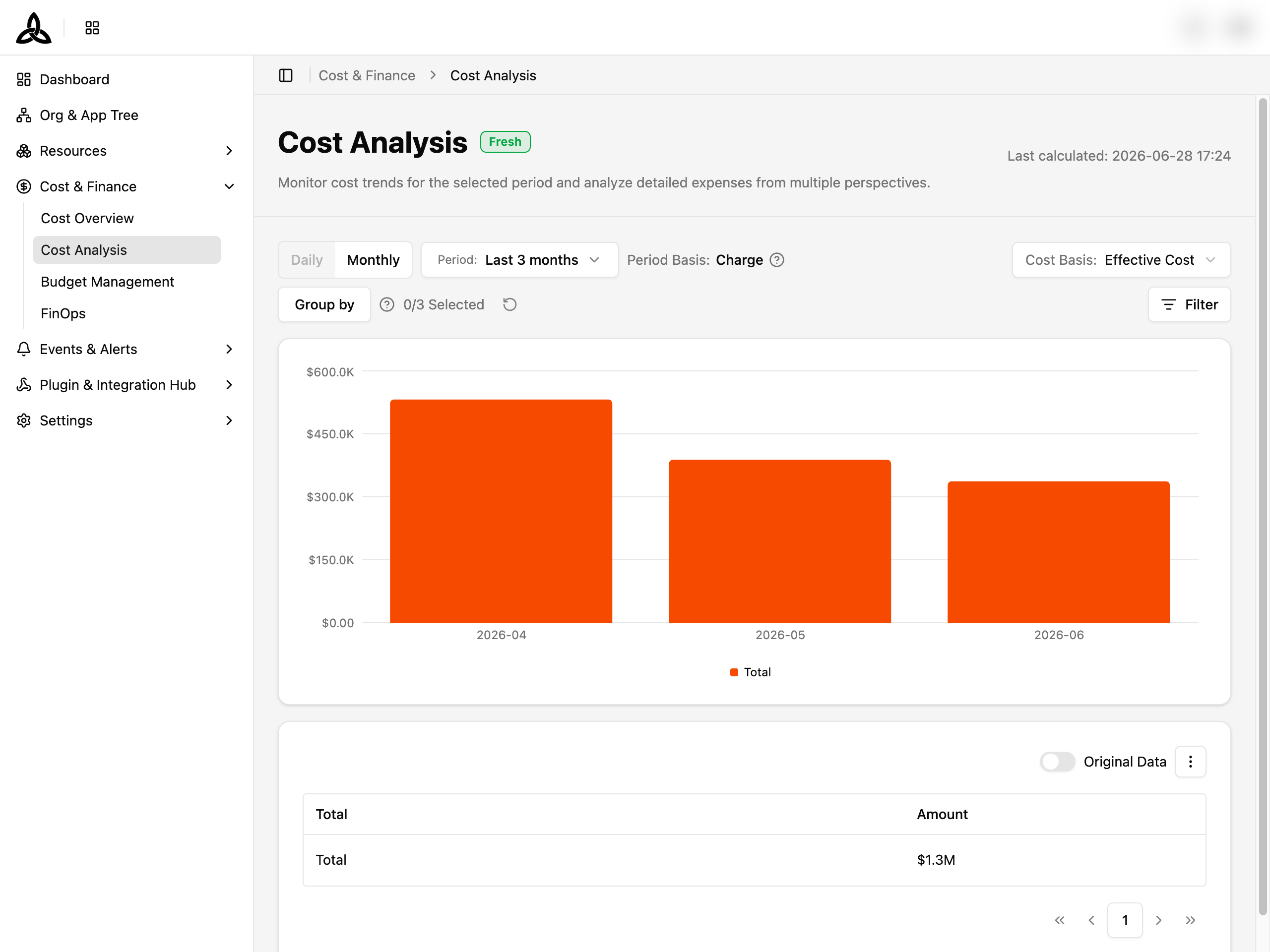
Page Layout
| Section | Purpose |
|---|---|
| Header | Page title, data-freshness badge, and the Last calculated timestamp |
| Control Panel | One card holding Library (saved conditions) on the top row and the collapsible Filters below it |
| Cost Trend | Chart of cost over the selected period, with one Group-by dimension active at a time |
| Result | Tabular breakdown matching the chart, with a Total footer row and the Export button in its toolbar |
Data freshness
The badge next to the page title reports the state of the most recent cost collection. When collection is not healthy, a banner appears above the Control Panel with a Source Details link that opens a per-source status dialog.
| Badge | Meaning |
|---|---|
Fresh | The latest run completed normally — data is up to date |
Delayed | The latest run is delayed; data may refresh shortly |
Stale | The latest run is old; data may not be current |
Partial | Some sources are missing — data is partial |
Failed | The latest run failed; data was not refreshed |
Unknown | Calculation status could not be determined |
Library
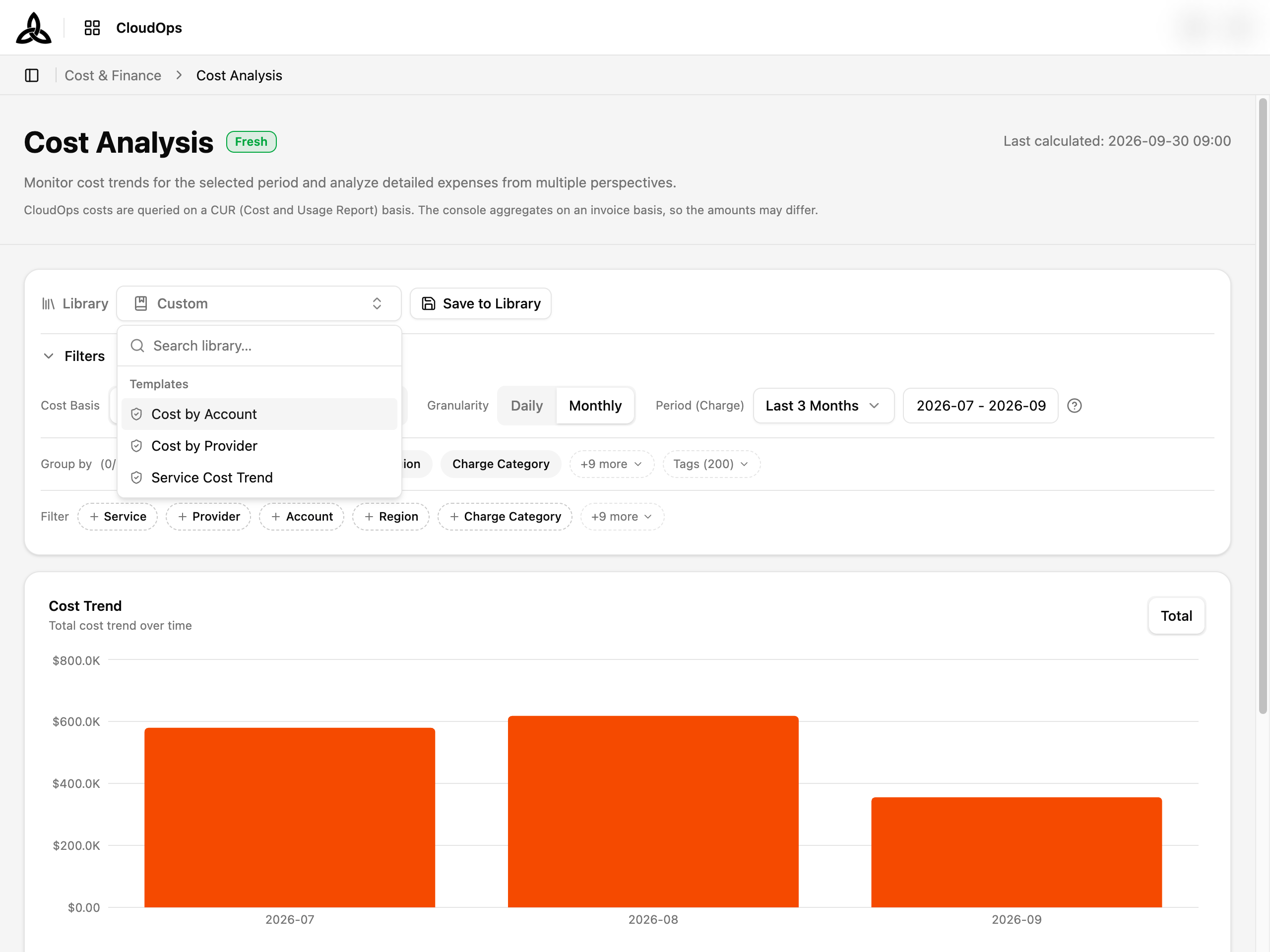
Library stores a full set of analysis conditions — Granularity, Period, Cost Basis, Group by, and Filters — so you can return to the same view without rebuilding it.
| UI element | Description |
|---|---|
| Library selector | Opens the list of saved items with a search box. Shows Custom when the current conditions do not match any saved item |
| My Library | Items you saved yourself. This group appears only once you have saved at least one item |
| Templates | Read-only items provided with the product: Cost by Account, Cost by Provider, Service Cost Trend |
| ⋮ (manage) | Appears while a library item is active. Duplicate is always available; Rename and Delete are available for My Library items only |
| [Save to Library] | Appears when the current conditions are not already saved as the active item |
Custom with [Save to Library] available again.Saving the current conditions
Set the conditions you want to keep
Adjust Cost Basis, Granularity, Period, Group by, and Filters until the chart and table show what you need.
Click [Save to Library]
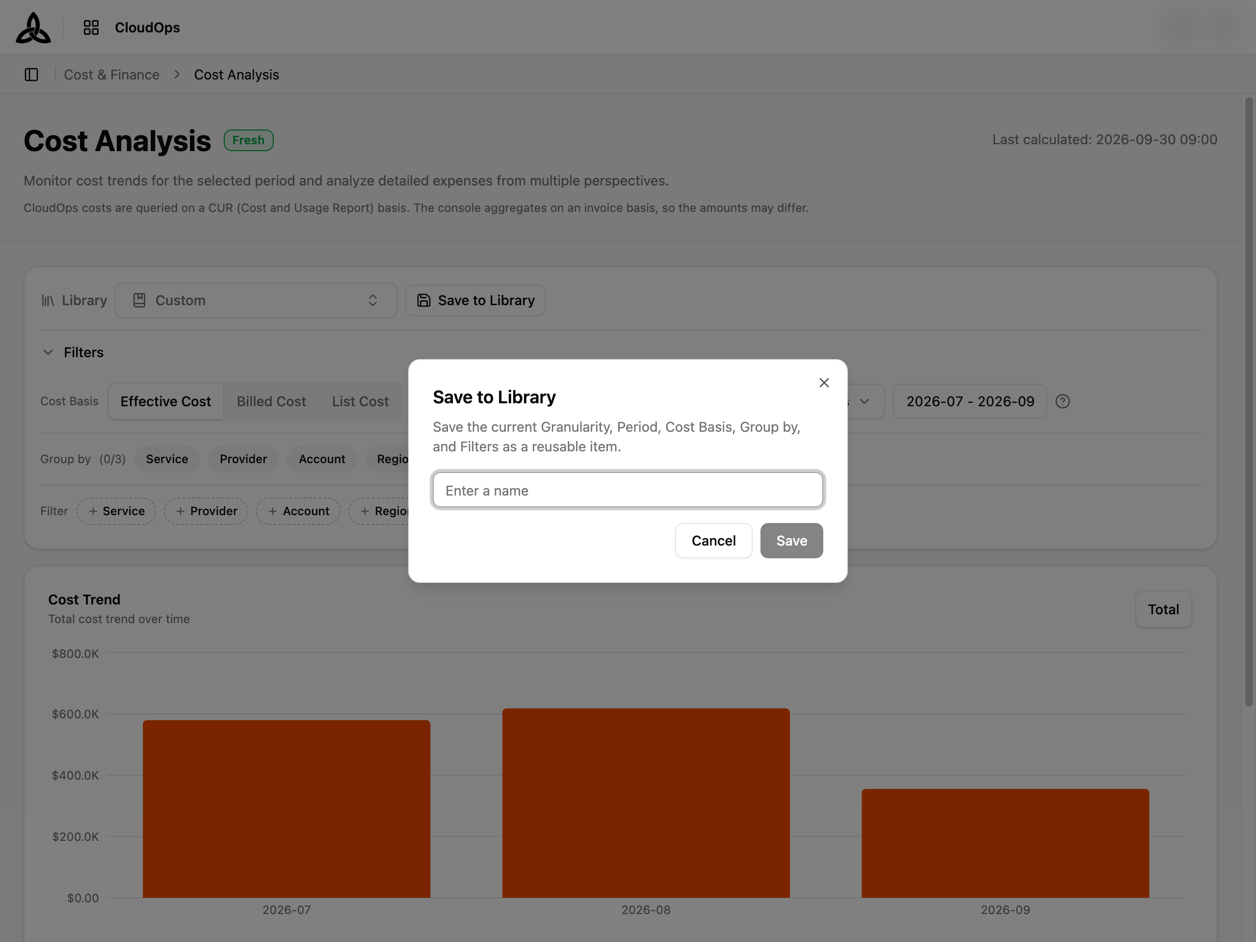
Enter a name and click [Save]
Names must be unique. Reusing an existing name is rejected with A library with this name already exists.
Export
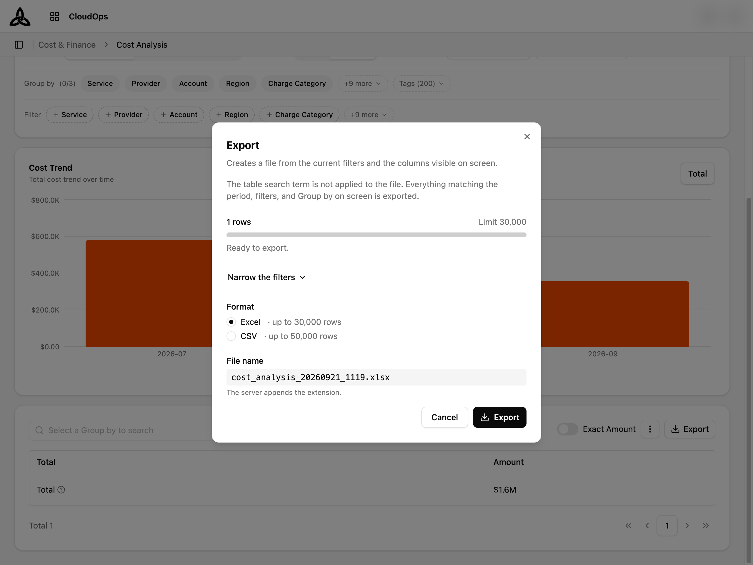
Export sits in the toolbar of the Result table, next to ⋮, and downloads that table as a file. It opens a dialog rather than downloading straight away, because cost data can be large: the dialog counts the rows the current conditions produce against the limit — Excel up to 30,000 rows, CSV up to 50,000 — and lets you Narrow the filters (period, Group by, account) when the count is over it.
| Step | What to do |
|---|---|
| Narrow the filters | Only needed while the row count is over the limit. Pick a shorter period, drop a Group-by dimension, or choose a single account |
| Format | Excel or CSV |
| File name | Generated from the resource and the time, quoting the name of the active library item when one is selected; the server appends the extension |
| [Export] | Enabled once the count is within the limit. The download starts automatically when the file is ready |
The file has the same shape as the table: one column per Group-by dimension followed by Amount, at the same total granularity — one row per group for the whole period, with no date column, so the figures match the rows you see. The table’s search box is not applied to the file; the dialog says so at the top. If the server refuses the export (row limit, file too large, timeout), the dialog reports the reason instead of waiting.
Filters

The Filters section drives both the chart and the table. Reloading the page or sharing the URL preserves the active conditions.
Cost Basis, Granularity, and Period
| Control | Description |
|---|---|
| Cost Basis | Effective Cost (default) — net cost after discounts, credits, and commitment savings (RI/SP); Billed Cost — the amount invoiced by the provider; List Cost — on-demand list price before any discount |
| Granularity | Daily or Monthly. Daily is available only for periods of up to 2 months |
| Period (Charge) | A preset (This month (MTD), Last 3/6/12/24 months, …) plus an explicit month range. Costs are aggregated by the provider’s charge date, not the resource usage date |
Billed Cost does not support daily figures — selecting it disables the Daily granularity. Cost data is retained for up to the last 2 years, and a single range can span at most 2 years.Group by

Group by decides which dimensions break the cost down. The counter next to the label shows how many of the maximum 3 dimensions are in use.
| Behavior | Description |
|---|---|
| Selecting | Click a chip to add the dimension; click the × on a selected chip to remove it |
| More dimensions | The first five dimensions are shown as chips; the rest sit behind the +N more popover, which has its own search box |
| At the limit | Once 3 dimensions are selected, +N more is disabled and explains that one must be removed first |
| Reset | The ↻ button at the right end clears every selected dimension |
Available dimensions include Service, Provider, Account, Region, Charge Category, Resource Type, Resource ID, Organization, and Application.
Grouping by CSP tags
Cloud provider tags are offered as their own axis rather than being mixed in with the dimensions above. The Group-by popover carries a separate Tags section — with its own Search tag box — listing the tag keys collected from your accounts, so a tag key with the same name as a dimension is never ambiguous.
Filter
The Filter row narrows the data to specific values within a dimension. Each dimension is a chip — click one to pick values for it.
Select a Group by to add filters. until you set one.Collapsing the panel

Click Filters to collapse the panel and free up vertical space. The collapsed row summarizes the active conditions — Granularity, Period, Cost Basis, Group by, and Filter. When filters are active, the summary shows a +N badge; hovering it lists the selected values per dimension.
Cost Trend
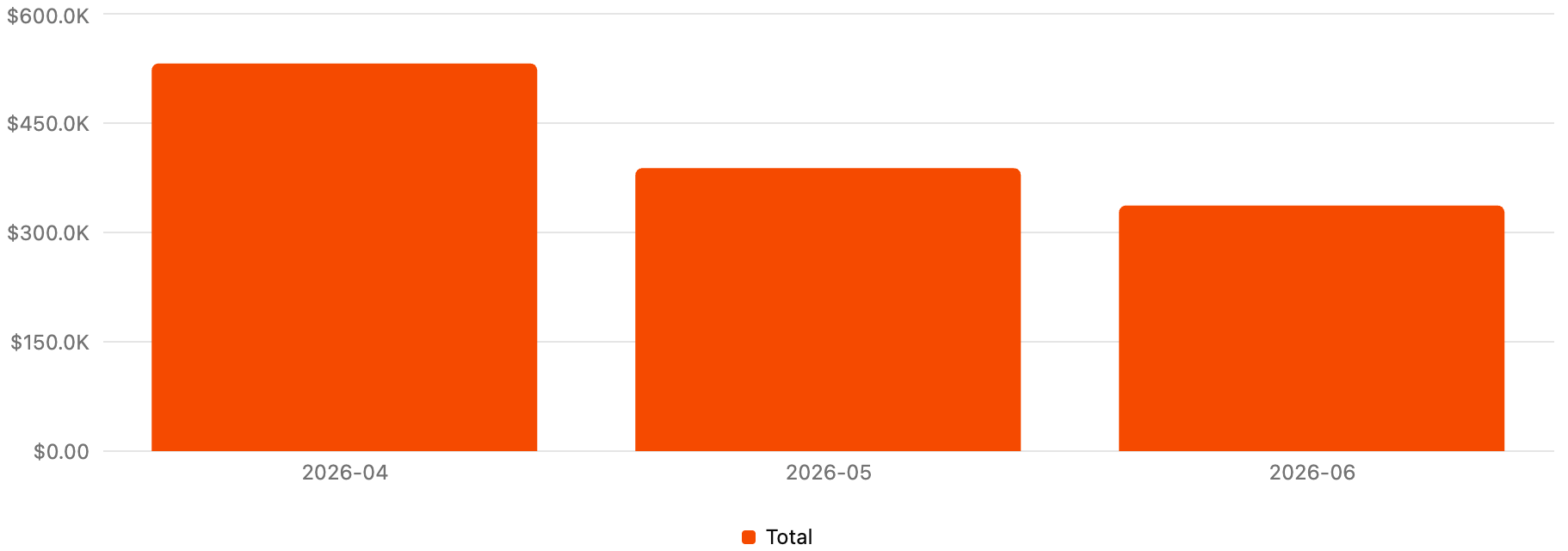
The chart plots cost over the selected Period at the chosen Granularity.
| Element | Description |
|---|---|
| Dimension tabs | The tabs at the top-right hold one entry per selected Group-by dimension. Click one to redraw the chart broken down by that dimension |
| Description | Reads Grouped by <dimension> while a dimension is active, or Total cost trend over time when no Group by is set |
| Legend | One entry per series, below the chart. Click an entry to toggle that series on or off |
Others | When more series exist than the chart can render, the lower-ranked ones are bundled into a single Others series |
| Empty states | No cost data for the selected period. when there is no data, or No cost data matches the active filters. Adjust the filters and try again. when filters excluded everything |
Result
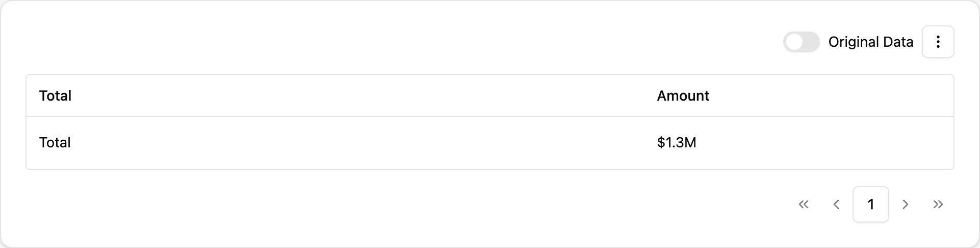
The table breaks down the same data as the chart, using every selected Group-by dimension at once rather than one at a time.
| UI element | Description |
|---|---|
| Columns | One column per Group-by dimension, followed by Amount. Changing Group by reshapes the columns immediately |
| Total row | A footer row sums the amount across every item in the selected period |
| Exact Amount | Toggle — when on, full numeric values are shown instead of abbreviated ones such as $12.6M |
| ⋮ | Set Display opens the display options (rows per page, column order, visibility, and pinning — up to 2 columns can be pinned to the left); Refresh re-fetches the current result |
| Export | Opens the export dialog described above |
| Pagination | Page controls sit below the table, with the total item count at the left |
Searching the result
The Result table has its own search box, and it searches the whole result set on the server — not just the rows on the current page. A match on page 40 is found without paging to it.
The placeholder names what is actually searchable, which follows the columns currently in play — Search by Name, ID.... Search needs a grouping to work against, so until one is set the box is disabled and reads Select a Group by to search.
No data with Nothing to display for the selected period., or No data matches the active filters. Adjust the filters and try again. when filters excluded every row.First visit
The first time you open the page, a short guided tour highlights Library, Filters, Cost Trend, the chart dimension tabs, and Export. Click [Skip] to dismiss it — it does not reappear on later visits.