AI Monitoring
On the [AI Asset > AI Monitoring] page you review how your monitored AI Assets are actually behaving — what looked unexpected, what it cost, and how many tokens it was consumed by. The assets and the detection rules behind these figures are registered under AI Management.
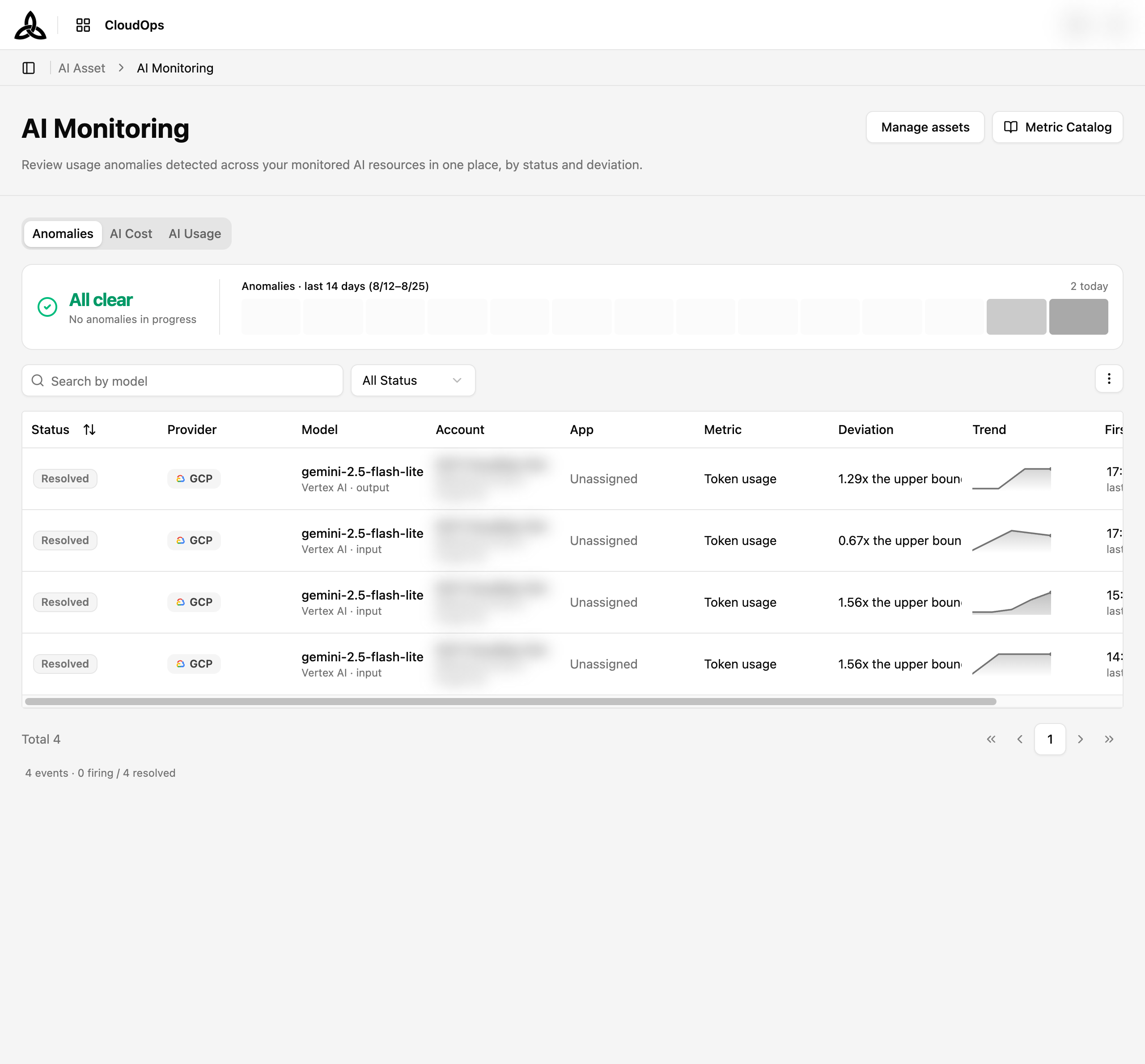
Tabs

AI Monitoring holds three tabs over the same set of assets, each answering a different question.
| Tab | Question it answers |
|---|---|
| Anomalies | Did anything behave unexpectedly? |
| AI Cost | What is the usage costing? |
| AI Usage | How many tokens are being consumed, and by which model? |
Each tab keeps its own filters in the URL, so switching tabs does not carry one tab’s filters into another.
Anomalies
The Anomalies tab collects every usage anomaly detected across your monitored AI Assets, so you can triage them in one place.
Situation Card
The card above the table is a status line, not a metric.
| State | Meaning |
|---|---|
| All clear | Nothing is currently firing |
| n firing | Anomalies are in progress. Click the card to filter the table down to just those |
Next to it, Anomalies · last 14 days charts daily counts so a quiet week and a noisy one are distinguishable at a glance, with today’s count called out on the right.
Viewing

Search matches the model. The dropdown filters by status, and the ⋮ button opens column and page-size settings.
| Column | Description |
|---|---|
| Status | Whether the anomaly is still firing or has resolved |
| Provider | Cloud provider of the asset |
| Model | The model the anomaly was detected on, with its AI service and token direction (input / output) |
| Account | Cloud account the asset belongs to, named the same way the cloud account list names it |
| App | Application the asset is assigned to, by name, or Unassigned |
| Detection | The rule that flagged it, written as metric · sensitivity — for example Token usage · Medium |
| Deviation | How far the measured value strayed from its expected range |
| Trend | A sparkline of usage around the event |
| First seen · Resolved | When the anomaly was first seen and when it cleared, with how long it lasted |
A summary line under the table reports the total split into firing and resolved.
The leading columns stay in place while you scroll the table sideways, so the model and status do not scroll away from the numbers.
Sensitivity
Rules are tuned by sensitivity rather than by a hand-set number. The value trades misses against false alarms:
| Sensitivity | Behaviour |
|---|---|
| High | Flags a value that strays only slightly outside its usual range. Fewer misses, but more false alarms |
| Medium | The default. Balances misses and false alarms for most metrics |
| Low | Flags only a value far outside its usual range. Fewer false alarms, but small anomalies may slip through |
Unknown, the server returned a sensitivity this version does not recognise — check the rule in AI Management.Anomaly Detail
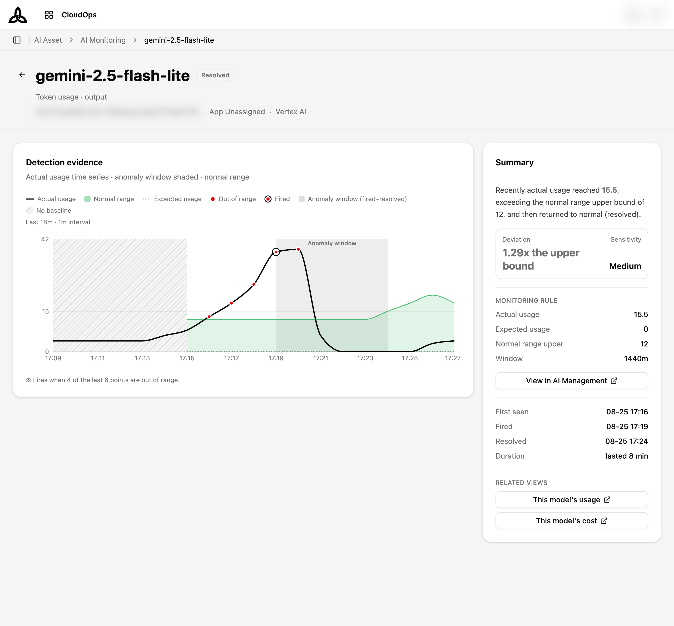
Clicking a row opens the event. The title is the model, with the status beside it and the metric, account, App, and AI service underneath.
Detection evidence
The chart plots the usage time series around the event, with the anomaly window shaded and three moments marked:
| Marker | Meaning |
|---|---|
| Onset | When the condition started |
| Fired | When it had held long enough to be raised as an anomaly — the delay between Onset and Fired is the rule’s Sustain |
| Resolved | When usage returned to normal |
Where the rule has a threshold to draw, a single Threshold line is laid over the series so the gap between usage and the line is readable at a glance.
Stretches where no baseline had been established are drawn as a distinct No baseline region rather than as a flat line at zero — the evaluation did not run there, which is different from “usage was zero”. Hovering such a point says No evaluation ran at this time, and a point carried over from the previous evaluation is marked Backfilled.
The region runs right up to where the normal-range band starts, so there is no unexplained gap between “nothing was being judged” and “judging began”.
Summary
The right-hand panel restates the event as a sentence — what rose, how far, and whether it is still going — then backs it with the numbers. It is written in the terms the screen uses elsewhere (actual usage, expected usage, normal range) rather than in statistical notation:
| Item | Meaning |
|---|---|
| Deviation | How far the value strayed from what was expected |
| Actual usage / Expected usage | The measured value the verdict was made on, against what was expected of it |
| Normal range upper | The top of the normal range — the value being over this is what tripped the rule |
| Window / Sustain | The rule’s observation window and how long the condition had to hold |
| First seen / Fired / Resolved / Duration | The event’s timeline |
View in AI Management opens the asset behind the anomaly and Edit Rule jumps to the rule that raised it. Under Related views, This model’s usage and This model’s cost carry the same model into the AI Usage and AI Cost tabs.
AI Cost
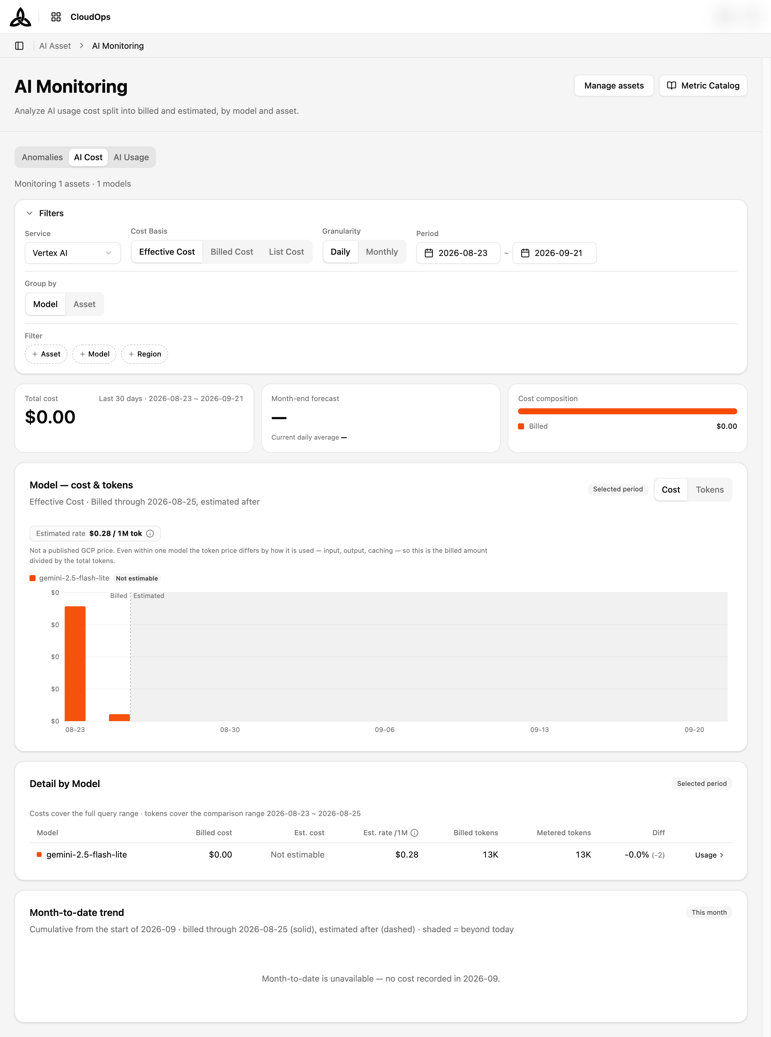
The AI Cost tab breaks down what your monitored AI usage actually costs, split into what has already been billed and what is still an estimate.
Filters
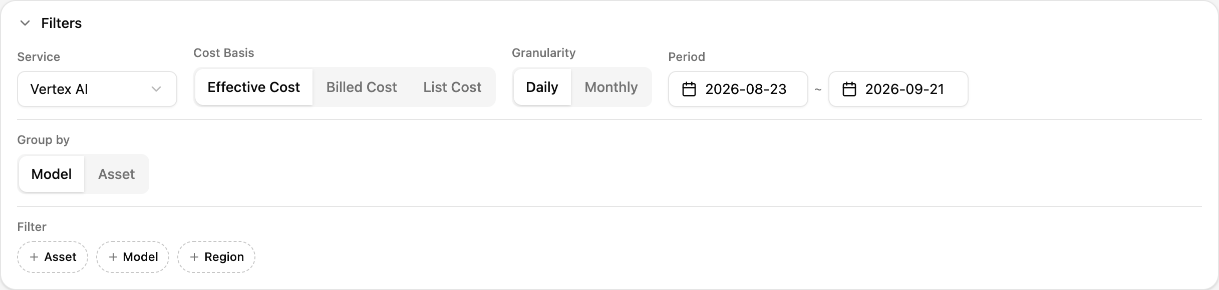
| Filter | Choices | What it changes |
|---|---|---|
| Service | The AI service to analyze | Scopes the whole page to one service |
| Cost Basis | Effective Cost · Billed Cost · List Cost | Which price the numbers are based on |
| Granularity | Daily · Monthly | The bucket size of the main chart |
| Period | Start and end date | The query range |
| Group by | Model · Asset | Whether the chart and detail table split by model or by asset |
| Filter | Asset · Model · Region | Optional narrowing on top of the above |
A line above the card reports how many assets and models are in scope, so you can tell at a glance whether a filter cut more than you intended.
Summary Cards
| Card | Meaning |
|---|---|
| Total cost | Cost over the selected period. When part of it is estimated, a caption says how much |
| Month-end forecast | Projected cost for the full month, with the current daily average underneath |
| Cost composition | A bar splitting the total into Billed and Estimated, with both amounts |
Cost composition is the quickest way to judge how much of what you are looking at is settled. A total that is mostly estimated will still move as billing catches up.
Model — cost & tokens
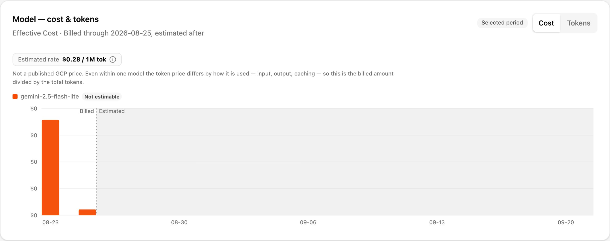
Bars per period, coloured by model (or by asset, if you grouped that way). The subtitle states the cost basis and the date billing runs through, and a shaded region marks everything past the Billed / Estimated boundary.
The Cost / Tokens toggle switches the same bars between money and token counts, so a model that is cheap but chatty is easy to spot.
Detail by Model

| Column | Description |
|---|---|
| Model | Model name, colour-matched to the chart |
| Billed cost | Cost the provider has already billed |
| Est. cost | Estimated cost for the not-yet-billed part |
| Est. rate /1M | The blended rate described above, per million tokens |
| Billed tokens | Tokens the provider billed for |
| Metered tokens | Tokens CloudOps measured itself |
| Diff | The gap between the two token counts |
The Usage link on each row carries that model into the AI Usage tab.
When there is no measurement
Billed amounts and metered tokens do not always start on the same day, and the screen says so instead of showing a zero:
| Situation | What the screen says |
|---|---|
| Metering began partway through the range | Token measurement starts <date>. Before that, only billed amounts exist — no measurement. |
| The asset is registered but nothing has been metered yet | Registered <date>, but no token measurement has arrived yet. Only billed amounts are shown. |
| A single row has no metered figure | The token cell reads Not metered |
Not metered is not the same as zero usage. It means CloudOps has no measurement for that span — the billed amount beside it is still real.Month-to-date Trend

Cumulative spend from the first of the month, always for the current month regardless of the Period filter above.
| Line | Meaning |
|---|---|
| This month billed | Solid — the settled figure, up to the billed boundary |
| With estimate | Dashed — the same curve continued with estimated cost |
| Prev month, same period | Last month at the same day-of-month, for comparison |
Two vertical markers frame the reading: Billed boundary where billing data stops, and Today. The region past today is shaded, since nothing there has happened yet. Under the chart, the cumulative figure and the current daily average are the two numbers behind the Month-end forecast card.
AI Usage
The AI Usage tab breaks down one asset’s metered token usage by model and by token type, at minute, hour, or day resolution. Where AI Cost answers what is this costing, this tab answers what is actually being consumed.
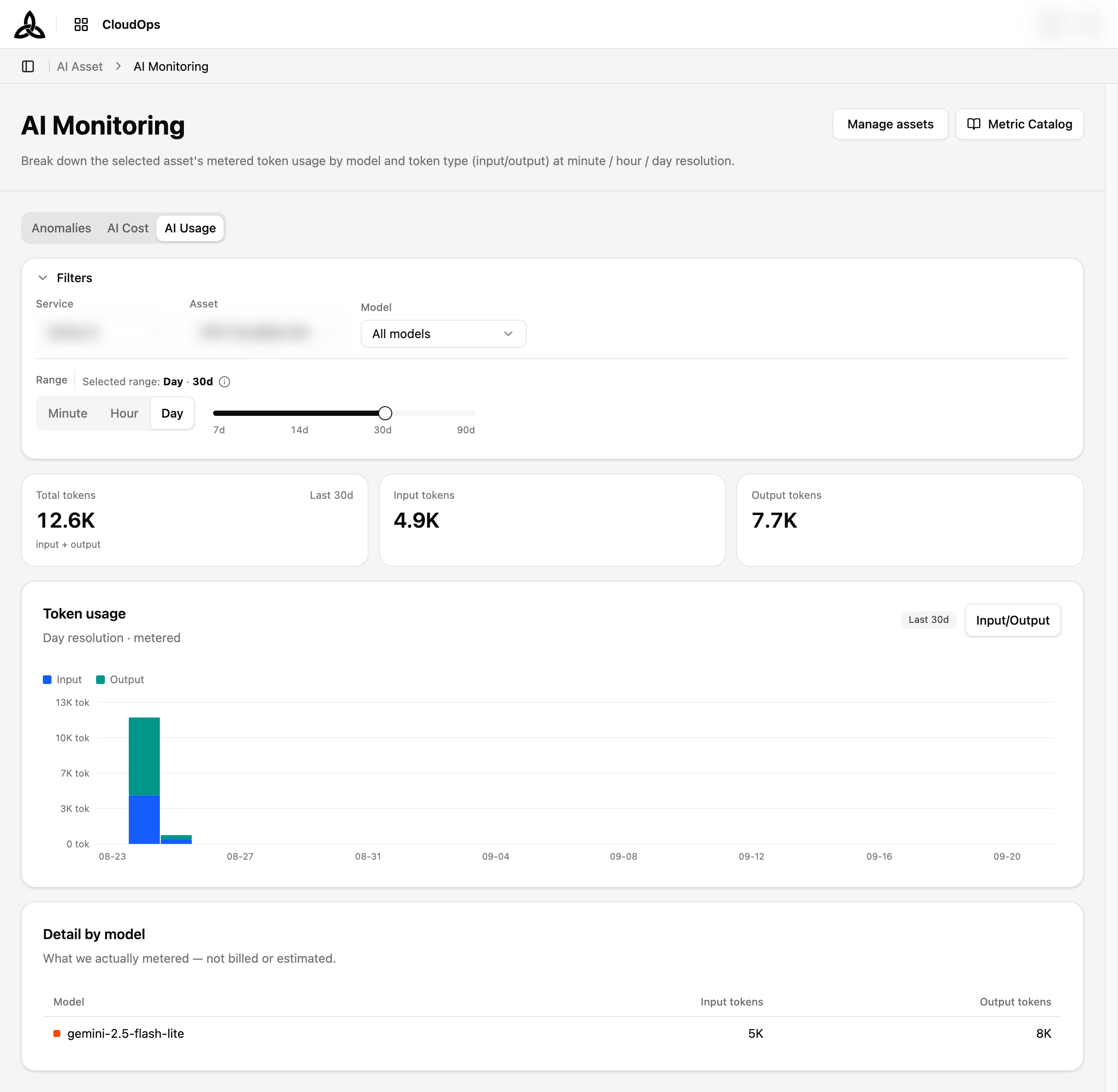
Filters

| Filter | Choices | What it changes |
|---|---|---|
| Service / Asset | The provider service and one registered AI asset | Everything on the tab is scoped to this asset |
| Model | All models, or one | Narrows the chart and table to a single model |
| Range | Minute · Hour · Day, plus a length slider (7d / 14d / 30d / 90d) | Both the bucket size and how far back to look |
Summary Cards
| Card | Meaning |
|---|---|
| Total tokens | Input plus output over the selected range |
| Input tokens | Tokens sent to the model |
| Output tokens | Tokens the model generated |
Keeping input and output apart matters because they are priced differently — a workload heavy on output costs more than the same token count spent on input.
Provisioned Throughput
Where the asset’s account holds Vertex AI provisioned throughput, a snapshot of that reservation sits above the token totals.
| Card | Shows |
|---|---|
| Utilization | How much of the reserved capacity is actually being used, with a status badge |
| Provisioned | The capacity you bought, as a token limit in tok/s |
| Consumed now | What is being drawn right now — dedicated capacity only, with on-demand overflow excluded |
The status badge reads Underused, Healthy, Scale up, or Awaiting data, and Over reservation when consumption has passed the limit.
0%. An empty card would read as “we bought capacity and are not using it”, which is the opposite of the truth.Token Usage
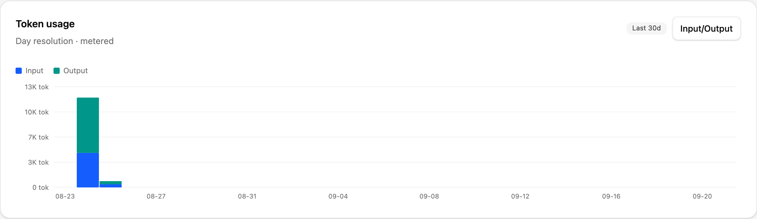
Stacked bars per bucket, at the resolution set in Range. The toggle on the right switches how the stack is split:
| View | Splits the bars by |
|---|---|
| Input/Output | Token type — the shape of the workload |
| By model | Model — which model is doing the work |
Use Input/Output to see how the models are being used, and By model to see which model to look at next.
Detail by Model

| Column | Description |
|---|---|
| Model | Model name, colour-matched to the chart |
| Input tokens | Tokens sent to that model over the range |
| Output tokens | Tokens it generated |
The subtitle repeats the point worth remembering: these are metered figures, neither billed nor estimated. To see the same models expressed as money, switch to the AI Cost tab.