Basic Screen Layout
The CloudOps console is divided into three persistent areas: the Global navigation bar at the top, the Sidebar on the left, and the Main content area in the center.
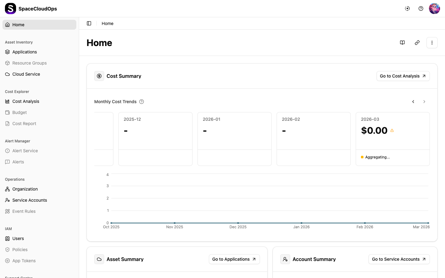
Common Screen Elements
| Element | Location | Description |
|---|---|---|
| Global navigation bar | Top | Fixed bar with service selector, workspace settings, and the profile avatar |
| Sidebar | Left | Collapsible menu organized by functional groups |
| Breadcrumb | Top of content area | Shows the current navigation path (e.g., Cost & Finance > Cost Overview) |
| Page Title | Below breadcrumb | The name of the current page |
| Action buttons | Top-right of content | Context-specific buttons (e.g., + Create, Filter, Refresh) |
Global Navigation Bar

The top bar persists across every page.
| Element | Position | Description |
|---|---|---|
| Service selector | Left | Switch between Megazone Cloud products |
| Settings | Right | Workspace-wide settings menu |
| Profile avatar | Far right | Your user initials. Click to open the profile dropdown |
Sidebar
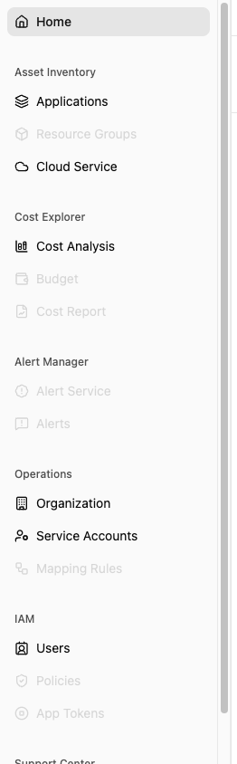
The sidebar groups all major console features. The active menu item is highlighted with a colored background. Items with a > chevron expand to reveal sub-menus; items without a chevron navigate directly to their page.
| Menu Item | Sub-menus | Description |
|---|---|---|
| Dashboard | — | At-a-glance overview of key metrics: active alerts, applications, resources, cost trends, and budgets at risk |
| Organization & Application | — | View the unified organization and application hierarchy |
| Resources | Resource Inventory, Change Tracking, Mapping Rules, CloudOps Tags | Browse collected resources, track changes, and govern tags |
| AI Monitoring | Resources, Anomalies | Monitor AI-managed resources and detect cost/usage anomalies |
| Cost & Finance | Cost Analysis, Cost Anomalies, RI/SP, Budget Management, Cost Optimizer, FinOps | Monitor cloud spend, analyze costs, simulate savings plans, manage budgets, and optimize spending |
| Events & Alerts | Well-Architected, Ticket Board, Notification Settings | Review Well-Architected assessments, manage tickets, and configure notification recipients |
| Reports | Monthly Report | Review last month’s cost, security, and operations in one document, finalize it as a snapshot, and schedule delivery |
| Plugin & Integration Hub | Webhook Management | Manage external integrations via webhooks |
| Settings | Onboarding Hub, Cloud Account, User & Policy | Set up the workspace, connect CSP accounts, manage users, invitations, and policies |
Profile Dropdown
Click the profile avatar in the top-right corner of the Global navigation bar.
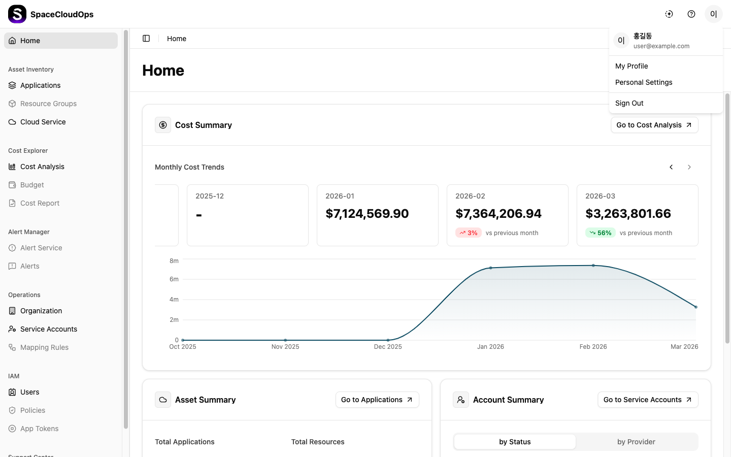
| Menu Item | Description |
|---|---|
| Logout | Sign out of the CloudOps console and return to the sign-in page |
Main Content Area
The main content area displays the page for the selected menu item. It typically includes:
| Element | Description |
|---|---|
| Breadcrumb | Navigation path at the top of the content area |
| Page Title | The name of the current page, sometimes with a count badge or info icon |
| Action buttons | Context-specific buttons (e.g., + Create, Filter, Refresh) in the top-right corner |
| Tabs | Some pages have tabs to switch between views (e.g., Members / Invitations / Policies) |
| Data tables | Sortable, searchable tables with pagination, row selection, and a floating bulk action bar |
| Detail panels | Clicking a row opens a detail side panel or navigates to a detail page with sub-tabs |
| Cards | Some pages display items as cards in a grid (e.g., Resource Inventory by provider) |
Example Page Navigation
Selecting a menu item from the sidebar opens that page in the main content area. The example below shows Cost & Finance > Cost Analysis.
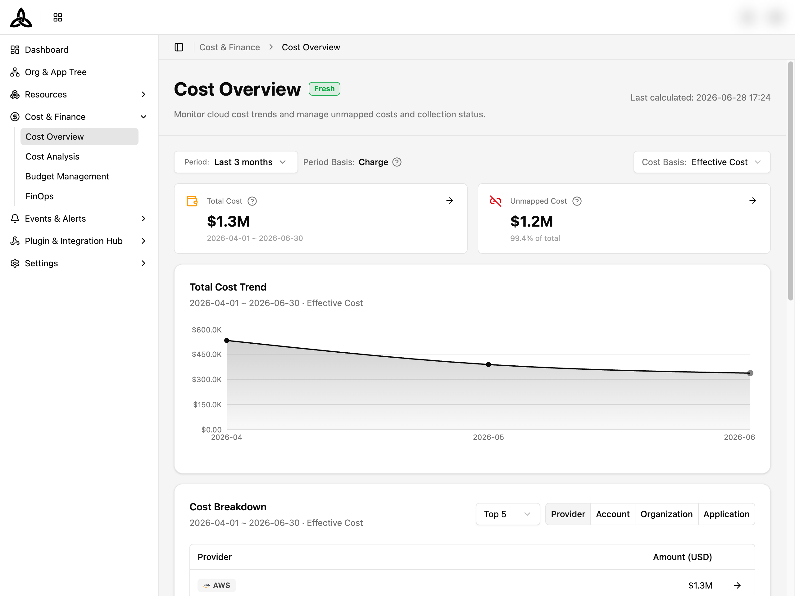
The page header shows the breadcrumb, the page title, and any context-specific action buttons. The body below presents filter controls, summary cards, and the page’s main visualizations.